
Big Image/Video (Section)
A big video/image component is a powerful and attention-grabbing elements designed to enhance the visual impact of your pages. It can act as a key storytelling tool that drives user engagement using compelling visual assets that convey the values, brand identity and strengths of the University.
When To Use This Component
This component should be used when you want to prominently display an image or video for storytelling purposes or to drive audiences to a related CTA.
USE CASES OR SCENARIOS
- Promote upcoming events or campus celebrations with a recap video or photo of a previous year with a registration CTA
- Image for simple brand storytelling; Video for dynamic campus experiences
- Share alumni success stories through impactful images or video testimonials
Component Do’s & Don’ts
There might be a time when you don’t know whether to use a Big Image/Video component or not. Here are some examples of how to effectively use a Big Image/Video component and when you shouldn’t use one:
DO
Use the Big Image/Video component when you want to highlight a single impactful image or video on your page with a call to action button. Include alternative text (alt text) for images to support accessibility.
DON’T
If you want to display multiple images, avoid stacking Big Image/Video blocks on top of each other, as this can reduce their impact. Instead, use the Image Gallery or Carousel component. Posting large images or videos back-to-back can disrupt user flow and diminish the primary focus of the Big Image/Video block.
How To Use This Component
- To build the Big Image/Video component, first select the SECTION block.
- For the big image component, select the IMAGE block and add it to the SECTION block.
- After the image is uploaded, click on the image and the options menu bar will appear.
- Click on the ALIGN option. Select WIDE WIDTH or FULL WIDTH options.
- For the big video component, select the YOUTUBE EMBED block and add it to the SECTION block.
- Repeat steps 2A and 2B.
Component Design Options
Below are the Big Image/Video component design options, with explanations of each and guidance on proper usage.
EDITABLE PARTS:
- Style:
- Default: The Title, Description, and CTA Button appear above and aligned horizontally across the top of the Big Image/Video.
- Columns: The Title, Description, and CTA Button are arranged in a left-aligned column layout. Choosing this option removes the Big Image/Video element.
- Block Heading:
- Show Block Heading: Option to turn off or on the header.
- Eyebrow Text (optional): An eyebrow text is a small line of text that appears above the title. Its purpose is to provide context, category information, or a subtle introduction to the main heading without drawing as much attention as the headline itself.
- Title (optional): A header title should clearly convey the blocks main topic, be visually prominent, and guide visitors through the content while maintaining readability and accessibility.
- Description (optional): The description provides a brief, clear summary that supports the header title and helps visitors quickly understand the block content.
- Button (optional): The button prompts users to take a specific action. Its text should be short, clear, and compelling, and the linked URL must be correct and active to ensure users reach the intended destination.
- Button Color: Green, Gold
- Block Options:
- Background Color: Gray, Black, White
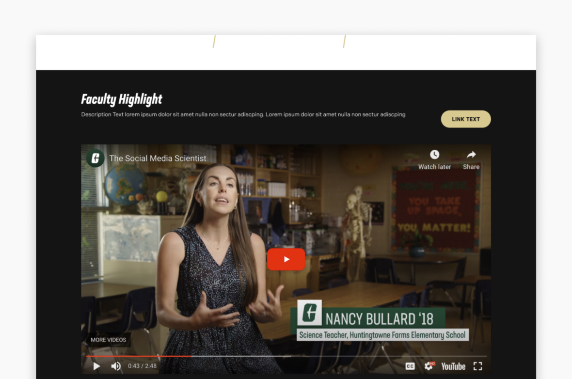
The example below shows the Big Image/Video Block in use, along with the selected configuration options.
- Styles: Default
- Block Heading:
- Show Block Heading: Yes
- Eyebrow Text: Alumni Network
- Title: Niner Nation: Rooted in Charlotte, Connected for Life
- Description: Your journey starts here, but it never ends. As part of Niner Nation…
- Button: URL: Example Link Text: Alumni Connections
- Button Color: Gold
- Block Options:
- Background Color: Black
Alumni Network
Niner Nation: Rooted in Charlotte, Connected for Life
Your journey starts here, but it never ends. As part of Niner Nation, you’re forever linked to a thriving alumni network, grounded in Charlotte and reaching far beyond.