A Blocklink Card component serves as a way to organize and display a small number of related links in a structured manner with visual weight on the page.
When To Use This Component
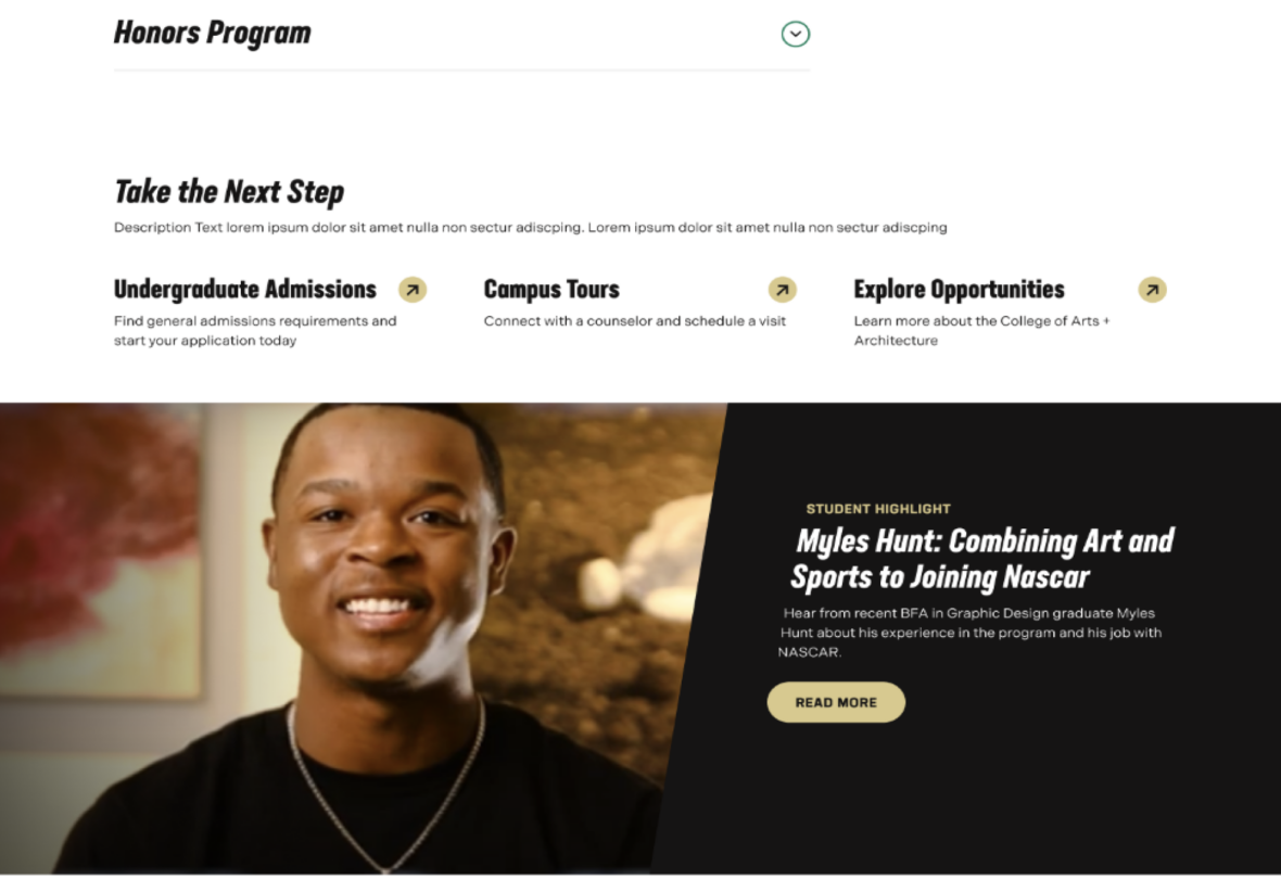
Use this component when you want to display between 2 and 8 links. It highlights these links on the page, giving them prominence while allowing them to be contextualized alongside related pages or resources. To maximize effectiveness, ensure that the links are meaningfully related, such as by topic, subject matter, or purpose.
USE CASES OR SCENARIOS
Provide next step CTAs on an admissions page (ex. visit, apply, request info)
Link to departments within a college (ex. architecture, art & art history, dance, music)
Link to department-hosted programs listed on academics.charlotte.edu, ensuring each program directs to its designated program page.
Component Do’s & Don’ts
There might be a time when you don’t know whether to use a Blocklink Card component or not. Here are some examples of how to effectively use a Blocklink Card component and when you shouldn’t use one:
DO
Use the Blocklink Card component to prominently showcase a small set of links or CTAs that are thematically related.
DON’T
If your content requires more than 8 BlockLinks for a subject, or if you need to link to a large number of pages or resources, use the Link List component instead.
Component Design Options
Below are the Blocklink Card component design options, with explanations of each and guidance on proper usage.
EDITABLE PARTS:
Block Heading:
Show Block Heading: Option to turn off or on the header.
Eyebrow Text (optional): An eyebrow text is a small line of text that appears above the title. Its purpose is to provide context, category information, or a subtle introduction to the main heading without drawing as much attention as the headline itself.
Title (optional): A header title should clearly convey the blocks main topic, be visually prominent, and guide visitors through the content while maintaining readability and accessibility.
Description (optional): The description provides a brief, clear summary that supports the header title and helps visitors quickly understand the block content.
Button (optional): The button prompts users to take a specific action. Its text should be short, clear, and compelling, and the linked URL must be correct and active to ensure users reach the intended destination.
Button Color: Green, Gold
Block Options:
Background Color: Gray, Black, White (For ADA Compliance, the colors you choose will alter the card color)
Card Color: Gray, Black, White, Transparent. (For ADA Compliance, the colors you choose will alter the background color)
Blocklink Card:
Title: The title should clearly convey the block’s main topic. Keep titles concise, avoid Triple stacking and do not use long titles.
Description (optional): The description should provide a brief, clear summary that supports the title and helps visitors quickly understand the block’s content. Use concise sentences, long paragraphs are not intended for this block.
Link: The call-to-action (CTA) text encourages users to take a specific action. In this block, the link text is not displayed but is replaced by a button. For ADA compliance, link text is still required, and the linked URL must be correct and active to ensure users reach the intended destination.
The example below shows the Blocklink Card in use, along with the selected configuration options.
Block Heading:
Show Block Heading: Yes
Title: Finish What You Started
Description: Life happens, but your degree is still within reach. The 49er Finish…
Button: URL: Example Link Text: Return Now
Button Color: Green
Block Options:
Background Color: Gray
Card Color: White
Finish What You Started
Life happens, but your degree is still within reach. The 49er Finish Program helps former UNC Charlotte students return, complete their studies and achieve their degree.
Whether you're looking for something specific or just exploring, we offer a range of courses tailored to help you boost your skills and advance your career.
Our post-baccalaureate programs are designed to encourage continued learning for graduate-level students. Take a class or two to learn a new language, gain a new skill or explore a career change.