Call To Action: Double
The Call to Action: Double block lets you feature two distinct CTAs side by side within a single component. Each CTA has its own title, description, and button, allowing you to clearly present two options or actions to your audience. You can select from available color combinations to match your page design,
When To Use This Component
USE CASES OR SCENARIOS
- When you want to offer two equally important actions in the same space.
- To guide users toward multiple but related next steps, such as “Apply Now” and “Request Info.”
- On pages where balanced layout and clear separation between CTAs help users make a choice.
Component Do’s & Don’ts
There might be a time when you don’t know whether to use a Call To Action: Double component or not. Here are some examples of how to effectively use a Call To Action: Double component and when you shouldn’t use one:
DO
Keep titles concise and descriptive, make descriptions short and easy to scan, and ensure each CTA button clearly communicates the intended action to guide users toward multiple but related next steps.
DON’T
Don’t overload titles or descriptions with long text, as it can break the layout and reduce readability. Avoid using this block for unrelated actions that might confuse users, and don’t place it on pages where a single primary CTA would be more effective. Additionally, don’t double stack Call to Action: Double blocks. If you need more CTA Blocks with descriptions, use the Blocklink Card or Image Card blocks instead.
Component Design Options
Below are the Call To Action: Double component design options, with explanations of each and guidance on proper usage.
EDITABLE PARTS:
- Block Options:
- CTA Left Color: Gray, Black, White (For ADA Compliance, the colors you choose may alter the CTA Right Color)
- CTA Right Color: Gray, Black, White (For ADA Compliance, the colors you choose may alter the CTA Left Color)
- CTA 1 & 2:
- Title: The title should clearly communicate the block’s primary topic. Keep titles concise and focused.
- Description: The description provides a brief, clear summary that supports the CTA title and helps visitors quickly understand the block content.
- Link: The button prompts users to take a specific action. Its text should be short, clear, and compelling, and the linked URL must be correct and active to ensure users reach the intended destination.
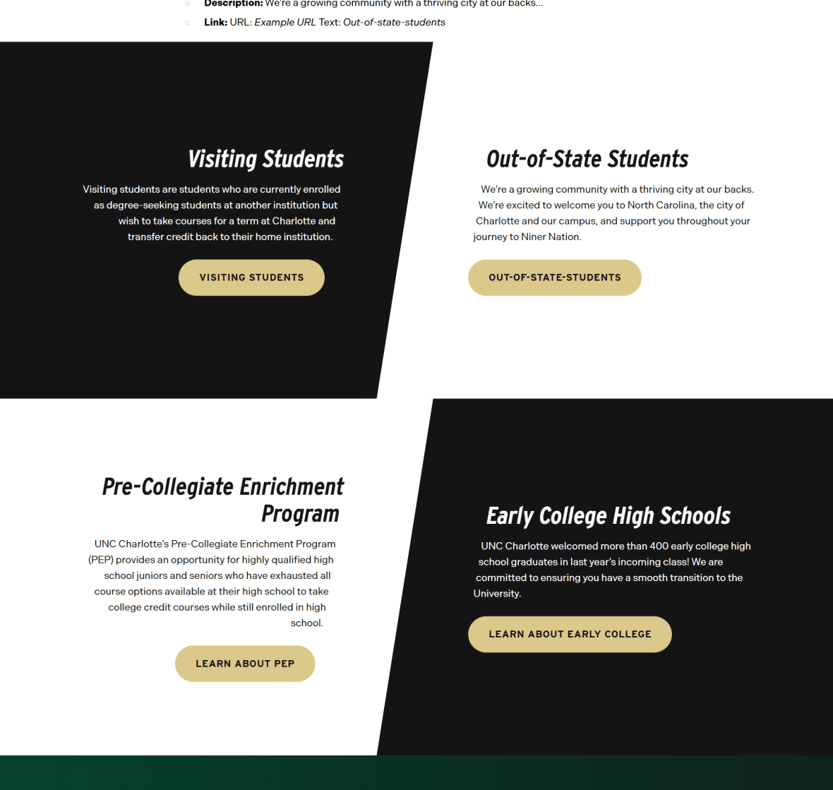
The example below shows the Call To Action: Double in use, along with the selected configuration options.
- Block Options:
- CTA Left Color: Black
- CTA Right Color: White
- CTA 1:
- Title: Visiting Students
- Description: Visiting students are students who are currently enrolled as…
- Link: URL: Example URL Text: Visiting Students
- CTA 2:
- Title: Out-of-State Students
- Description: We’re a growing community with a thriving city at our backs…
- Link: URL: Example URL Text: Out-of-state-students

Visiting Students
Visiting students are students who are currently enrolled as degree-seeking students at another institution but wish to take courses for a term at Charlotte and transfer credit back to their home institution.
Out-of-State Students
We’re a growing community with a thriving city at our backs. We’re excited to welcome you to North Carolina, the city of Charlotte and our campus, and support you throughout your journey to Niner Nation.