Call To Action: Image
The Call to Action Image component is designed to present key information in a visually engaging way. It allows you to include a header title, a description, and a call-to-action button, accompanied by a graphic to help illustrate your message. This combination makes it easy to capture users’ attention, communicate your content clearly, and encourage meaningful action.
When To Use This Component
The Call to Action: Image component is ideal for presenting key information in a visually engaging way, combining a header title, description, and call-to-action button with a graphic to reinforce the message. Use this component to highlight a single important action or piece of information that benefits from a visual representation. It works well when you want to guide users toward a specific next step, showcase content that requires context alongside a CTA, or create visually appealing sections on a page.
USE CASES OR SCENARIOS
- Promoting Events: Highlight a single upcoming event or full list events page, registration opportunities, or special programs with a compelling visual and clear CTA.
- Highlighting Key Programs or Resources: Showcase important university programs, academic resources, or student services that require attention or action. (link to department-hosted programs listed on academics.charlotte.edu, ensuring each program directs to its designated program page)
- Featuring Landing Page Content: Draw focus to key content on landing pages, ensuring users see and interact with high-priority information.
- Drawing Attention to Important Announcements: Emphasize critical updates, deadlines, or calls to action that need to stand out on the page.
Component Do’s & Don’ts
There might be a time when you don’t know whether to use a Call To Action: Image component or not. Here are some examples of how to effectively use a Call To Action: Image component and when you shouldn’t use one:
DO
When using the Call to Action Image component, keep titles short and clear so users can grasp the message at a glance. Write concise, scannable descriptions that support the CTA without overwhelming the user, and ensure each CTA button clearly communicates its intended action. Incorporate relevant, high-quality graphics that reinforce the message, while maintaining visual balance between text and image for a polished, professional appearance. Include alternative text (alt text) for images to support accessibility. Using two Call to Action: Image blocks back-to-back on the same page is acceptable when both blocks share a similar subject, providing a cohesive and visually consistent presentation of related content.
Don’t overload the Call to Action Image component with long titles or descriptions, as this can break the layout and reduce readability. Avoid using unrelated or generic images that might confuse users or dilute the message, and don’t use this component for content that isn’t visually or contextually suited for a combined text-and-image presentation. If using back-to-back CTA Image components, do not duplicate the same graphic, and avoid using more than two in a row, as this can clutter the page, increase scrolling, and reduce user effectiveness. If additional components are needed, consider using the Slider or Image Card components instead.
Component Design Options
Below are the Call to Action: Image component design options, with explanations of each and guidance on proper usage.
EDITABLE PARTS:
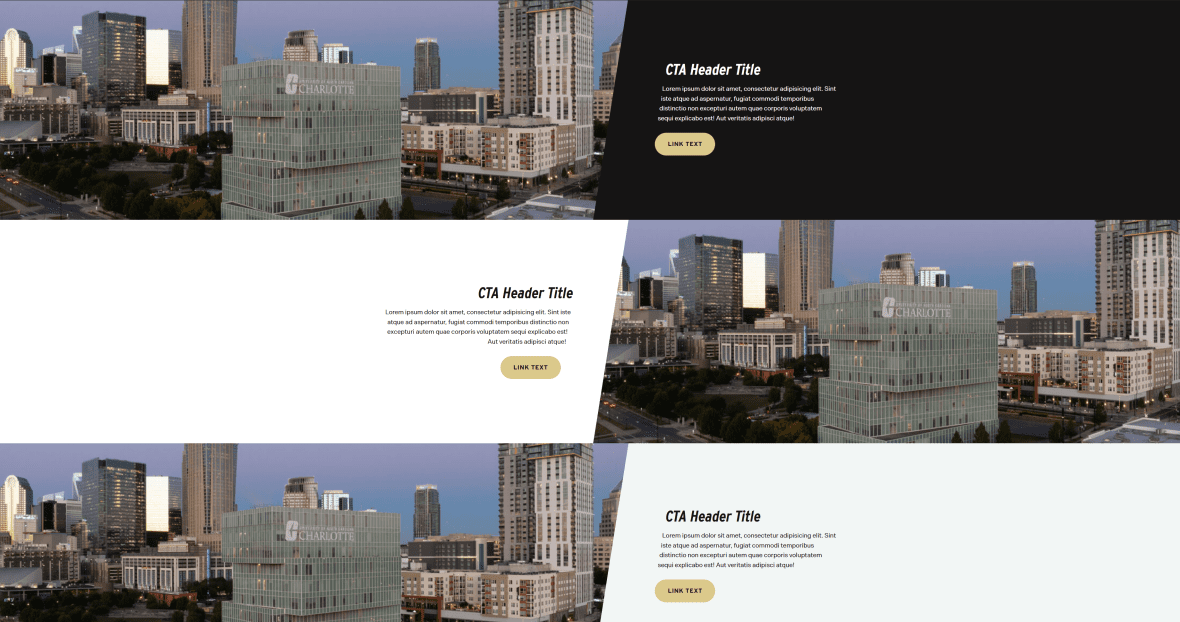
- Block Options:
- Background Color: Gray, White, Black
- Image Location: Left, Right
- Call To Action Image Card:
- Title: The title should clearly communicate the block’s primary topic. Keep titles concise and focused.
- Description: The description provides a brief, clear summary that supports the CTA title and helps visitors quickly understand the block content.
- Link: The button prompts users to take a specific action. Its text should be short, clear, and compelling, and the linked URL must be correct and active to ensure users reach the intended destination.
- Image: Incorporate relevant, high-quality graphics that reinforce the message, while maintaining visual balance between text and image for a polished, professional appearance.
The example below shows the Call To Action: Image in use, along with the selected configuration options.
- Block Options:
- Background Color: White
- Image Location: Right
- Call To Action Image Card:
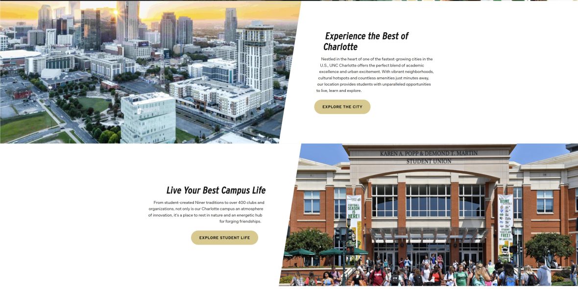
- Title: Live Your Best Campus Life
- Description: From student-created Niner traditions to over 400 clubs…
- Link: URL: Example Link Text: Explore Student Life

Live Your Best Campus Life
From student-created Niner traditions to over 400 clubs and organizations, not only is our Charlotte campus an atmosphere of innovation, it’s a place to rest in nature and an energetic hub for forging friendships.