Call To Action: Simple
The Call to Action: Simple component has three basic styles, each with some customizable options. Each style can be wide, spanning the width of the viewport, or full, spanning the full width of the content area. The simple style has an additional Narrow alignment, which spans the width of the narrow content region on desktop devices.
When To Use This Component
The Call to Action: Simple component is ideal for highlighting a single action or message on a page in a clean, straightforward way. With three basic styles and multiple alignment options, including Wide, Full, and Narrow (for desktop content regions), this component provides flexibility while keeping the focus on a clear CTA. Use this component when you want to draw attention to one primary action without overwhelming the user with additional content.
USE CASES OR SCENARIOS
- Promoting a single action: Such as “Apply Now,” “Request Information,” or “Register.”
- Highlighting key resources: Direct users to important forms, guides, or documents.
- Announcements or alerts: Emphasize deadlines, updates, or time-sensitive information.
- Landing pages or section breaks: Provide a clear next step for users moving through content.
Component Do’s & Don’ts
There might be a time when you don’t know whether to use a Call To Action: Simple component or not. Here are some examples of how to effectively use a Call To Action: Simple component and when you shouldn’t use one:
DO
Keep the title concise and clear so users can immediately understand the action. Use direct, action-oriented CTA text that clearly communicates the intended next step, and select the appropriate style and alignment (Wide, Full, or Narrow) based on the page layout and content context. This component works best for a single primary action to maintain focus and reduce user confusion. Test its placement on the page to ensure it fits naturally with surrounding content and effectively guides users toward the desired action.
DON’T
Don’t overload the component with long titles or descriptions, as this can reduce readability. Don’t place the block in areas where it won’t be visually prominent or may be overlooked. Additionally, don’t duplicate the same CTA multiple times unnecessarily, as this can confuse users and dilute the effectiveness of the action. Do not use this component back-to-back; if two CTAs are required, use the Call to Action: Double component instead.
Component Design Options
Below are the Call To Action: Simple component design options, with explanations of each and guidance on proper usage.
EDITABLE PARTS:
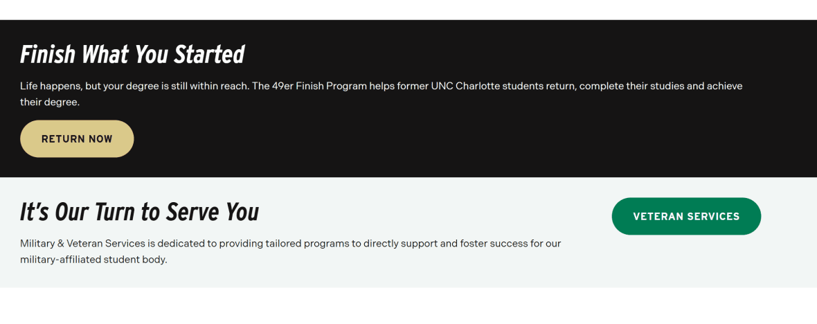
- Block Options:
- Background Color: Gray, Black, White
- Button Color: Green, Gold
- Button Location: Right, Bottom
- Call To Action Simple Card:
- Title: The title should clearly communicate the block’s primary topic. Keep titles concise, focused and short.
- Description: The description provides a brief, clear summary that supports the CTA title and helps visitors quickly understand the block content.
- Link: The button prompts users to take a specific action. Its text should be short, clear, and compelling, and the linked URL must be correct and active to ensure users reach the intended destination.
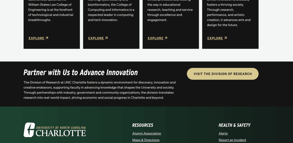
The example below shows the Call To Action Image in use, along with the selected configuration options.
- Block Options:
- Background Color: Black
- Button Color: Green
- Button Location: Right
- Call To Action Simple Card:
- Title: Latest Impacts of Niner Nation
- Description: Stay up-to-date with the latest news and achievements from….
- Link: URL: Example Link Text: See All News