The Event Card component is integrated with Campus Events (Localist) and dynamically showcases events submitted to events.charlotte.edu. It provides users with detailed information about upcoming events, including titles, dates, times, and locations, in a visually engaging and easy-to-format. This component makes it simple for users to discover, explore, and engage with campus happenings, helping ensure important events reach the right audience.
When To Use This Component
Use the Event Card component to prominently display upcoming campus events in a clear, organized, and visually engaging way. It is designed to help users quickly find key event information—such as date, time, and location—while encouraging engagement and participation. Because the component integrates directly with Campus Events (Localist), it ensures event details remain accurate, up to date, and easy to discover across the site.
USE CASES OR SCENARIOS
Highlighting important dates, programs, or campus happenings
Department or program homepages
Student resource and engagement pages
Promotional sections for lectures, workshops, or special events
Component Do’s and Don’ts
There might be a time when you don’t know whether to use an Event Card component or not. Here are some examples of how to effectively use an Event Card component and when you shouldn’t use one:
DO
Use the Event Card to highlight upcoming events that are relevant to your audience, ensuring the title and event details are clear, concise, and easy to read. Include cards on pages where users are likely to look for events, such as department pages, student resources, or landing pages for programs. Take full advantage of the component’s integration with Campus Events (Localist) to display accurate and up-to-date information automatically.
DON’T
Don’t use the Event Card component for content that isn’t event-related, and avoid manually duplicating event cards with other components—let the integration with Localist ensure accuracy and prevent outdated information. Don’t overcrowd a page with too many Event Cards, as this can overwhelm users; it’s recommended to showcase no more than 2–3 events on main pages, since events will automatically rotate out as older events expire. To feature more events, create a separate events page where as many events as needed can be listed. Additionally, don’t include events that are irrelevant to the page’s audience, as this can reduce engagement and clarity.
How To Use This Component
Visit Campus Events and click the Log In button. Sign in using your NinerNet ID, then click “Submit An Event.”
Complete the submission form, filling in all required fields. The more detailed the information, the easier it will be for the Events Block to locate, identify, and showcase your event on your web page. Please allow up to 72 hours for event submission approval. You will receive an email notification once your event is approved.
If the event already exists in Campus Events, locate and review it. Pay attention to which fields were completed, as the Event Card Block uses the same filter system as the event submission form.
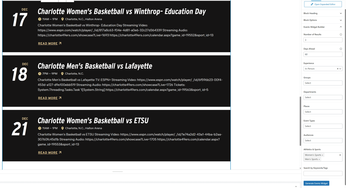
After completing the Block Heading and Block Options, click on Events Widget Builder. Fill in the fields that correspond to the event(s) you want to feature on your webpage.
Click Generate Events Widget. The Events Block will automatically populate with approved Localist events.
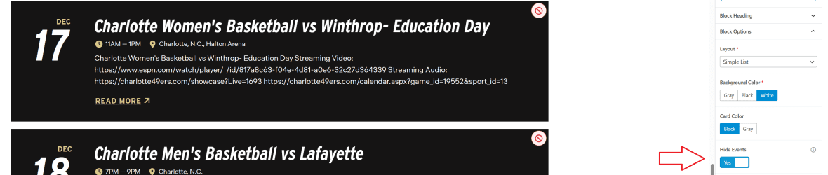
Depending on the filters you select, additional events may appear that you don’t want to display. To remove these events, go to Block Options and click Hide Events. A cancel button will appear on each event—simply click the cancel button to remove the event from your listing.
Component Design Options
Below are the Event Cards component design options, with explanations of each and guidance on proper usage.
EDITABLE PARTS:
Block Heading:
Show Block Heading: Option to turn off or on the header.
Eyebrow Text (optional): An eyebrow text is a small line of text that appears above the title. Its purpose is to provide context, category information, or a subtle introduction to the main heading without drawing as much attention as the headline itself.
Title (optional): A header title should clearly convey the blocks main topic, be visually prominent, and guide visitors through the content while maintaining readability and accessibility.
Description (optional): The description provides a brief, clear summary that supports the header title and helps visitors quickly understand the block content.
Button (optional): The button prompts users to take a specific action. Its text should be short, clear, and compelling, and the linked URL must be correct and active to ensure users reach the intended destination.
Button Color: Green, Gold
Block Options:
Layout:
Simple List: Horizontal layout with no image. The event date is displayed on the far left, followed by the event title, time, location, and additional details. The title links directly to the main event page on the Localist website for more information.
2-Up Grid: Vertical layout with image. Each event features an image at the top, with event details listed below. If no image was uploaded to the Localist posting, a standard ALL C logo will be displayed instead. Depending on the number of events you choose to list, events will be arranged in a 2×2 grid formation.
3-Up Grid: Vertical layout with image. Each event features an image at the top, with event details listed below. If no image was uploaded to the Localist posting, a standard ALL C logo will be displayed instead. Depending on the number of events you choose to list, events will be arranged in a 3×3 grid formation.
Featured: Horizontal layout with highlight date and image. This option showcases a single event. The event date is prominently displayed on the left with a green background, followed by the event details in the center, and the event image on the far right.
Background Color: Gray, Black, White (For ADA Compliance, the colors you choose will alter the card color)
Card Color: Gray, Black, White (For ADA Compliance, the colors you choose will alter the background color)
Hide Events: Yes, No. Provides the option to remove events that were automatically populated but are not needed.
Event Widget Builder: The Event Widget Builder is connected to the Localist Event system. Selecting specific fields will create filters to target and display selected events on your page.
Number of Results: Determines how many events are displayed on the webpage.
Days Ahead: Displays events scheduled further out on the calendar, up to a maximum of 365 days in advance.
Experience: Hyrbid, In-Person, Virtual (only one can be selected)
Groups: ex.) Data Science Prospective Students, Ph.D. Programs (multiple can be selected)
Departments: ex.) Business Services, Alumni Association (multiple can be selected)
Places: ex.) Atkins Library, Fretwell (multiple can be selected)
Event Types: ex.) Niner Nation Week, Admissions (multiple can be selected)
Audiences: ex.) All, Alumni (multiple can be selected)
Athletics & Sports: ex.) Women’s Sports, Soccer (M) (multiple can be selected)
Search by Keywords / Tags: Specific keywords and tags can be added when creating an event. This allows users to target specific programs and apply more precise filters when displaying events.
The example below shows the Event Card in use, along with the selected configuration options.
Block Heading:
Show Block Heading: Yes
Title: Athletic Events
Description: Feel the energy of every game, from fierce competitions to unforgettable…
Button (optional): URL: Example Link Text: See All Events
Button Color: Green
Block Options:
Layout: 3-Up Grid
Show Image: Yes
Background Color: Gray
Card Color: Black
Events Widget Builder
Number of Results: 3
Days Ahead: 31
Athletics & Sports: Men’s Sports, Women’s Sports
Athletic Events
Feel the energy of every game, from fierce competitions to unforgettable victories. Cheer on your fellow 49ers at the next home sporting event.
Charlotte Men's Tennis vs Rice Streaming Video: https://web.track.tennis/#/@charlotte-mens-tennis/@charlotte-mens-tennis https://charlotte49ers.com/calendar.aspx?game_id=19906&sport_id=10
Charlotte Men's Tennis vs Rice Streaming Video: https://web.track.tennis/#/@charlotte-mens-tennis/@charlotte-mens-tennis https://charlotte49ers.com/calendar.aspx?game_id=19906&sport_id=10
Charlotte Men's Tennis vs UTSA Streaming Video: https://web.track.tennis/#/@charlotte-mens-tennis/@charlotte-mens-tennis https://charlotte49ers.com/calendar.aspx?game_id=19907&sport_id=10
Charlotte Men's Tennis vs UTSA Streaming Video: https://web.track.tennis/#/@charlotte-mens-tennis/@charlotte-mens-tennis https://charlotte49ers.com/calendar.aspx?game_id=19907&sport_id=10