


The Image Cards component is a flexible, visually engaging way to pair imagery with text to create discreet, linkable cards. These cards can be used to guide users to related pages or to highlight images with supporting context. The component offers a range of customization options—including color themes, cards-per-row layouts, and image shapes—ensuring maximum design flexibility. Additionally, most elements within each image card are optional, allowing the component to adapt to a wide variety of content needs.
The Image Cards component has many uses, with its core purpose being to link to 2 to 4 related pages while providing strong visual presence. Because it is a fully manual component, it offers significant flexibility in how content is displayed. Image Cards can be used to present content in a visually structured, scannable format that encourages exploration, for example, using the circular image option to feature people or highlight images in a more stylized way.
USE CASES OR SCENARIOS
Image Cards work best when each card represents a distinct and equally important piece of content and when imagery helps reinforce the message or purpose of the link.
DO
Use high-quality, relevant images that support the content and align with university branding, and keep text concise by using short titles and brief descriptions so cards remain easy to scan. Ensure consistency across all cards by maintaining similar image styles, text lengths, and layouts, and use clear, descriptive link destinations so users understand what to expect when clicking a card. Additionally, include alternative text (alt text) for all images to support accessibility and ensure the content is usable by all audiences.
DON’T
Avoid overloading Image Cards with excessive text, as this can reduce clarity, create inconsistency between rows and diminish their visual impact. Do not use unrelated or purely decorative images that fail to add meaning or context to the content, and avoid using Image Cards for long-form content or complex information that is better presented in text-based layouts. Additionally, do not repeat the same link across multiple cards, as doing so can confuse users and reduce the effectiveness of the component.
Below are the Image Card component design options, with explanations of each and guidance on proper usage.
EDITABLE PARTS:
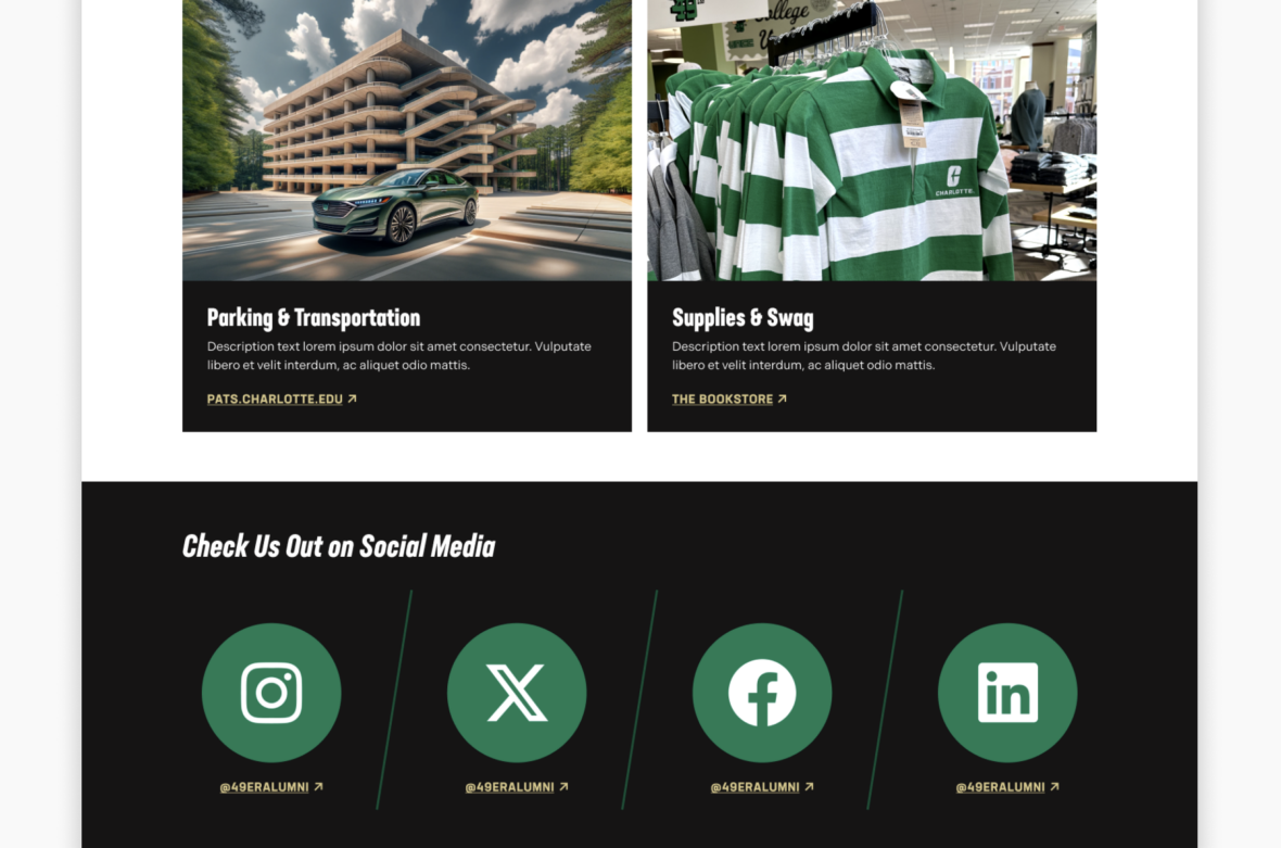
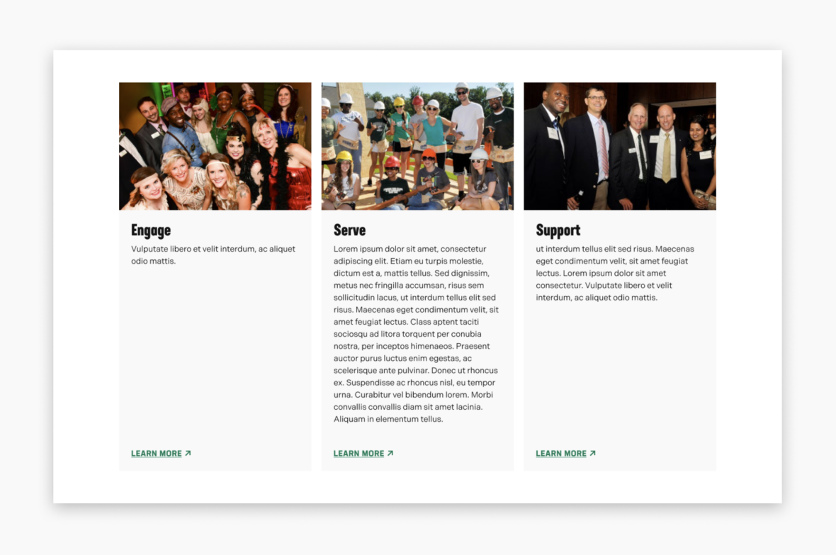
The example below shows the Image Card in use, along with the selected configuration options.