Image Carousel
A carousel component displays multiple pieces of thematically-related content within a limited space. It consists of a series of slides with optional titles and descriptions that manually transition from one to another.
When To Use This Component
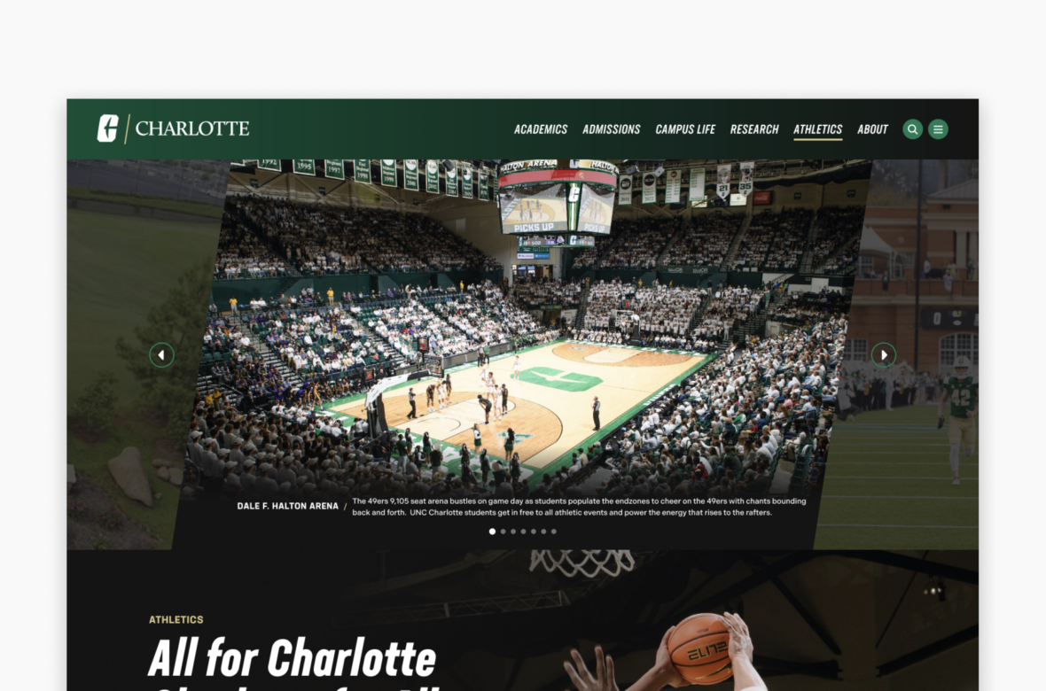
This component should be used when you want to display a number of related images but still want each one to be fairly large on the page. As opposed to an image gallery, it is also a good option if you want captions to be showing for every image (the optional caption will always be present on a carousel versus in the gallery where it’s only visible on hover).
USE CASES OR SCENARIOS
- A carousel of featured images from a University event
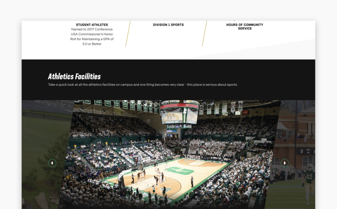
- Display photos of various athletic department facilities
Component Dos & Don’ts
There might be a time when you don’t know whether to use a carousel component or not. Here are some examples of how to effectively use a carousel component and when you shouldn’t use one:
DO
Use the Carousel component when you want to display multiple images (up to 10) one at a time in a rotating format within the body of a page. The carousel works best for thematically related content so each slide feels connected and purposeful. Use high-quality, consistent images that align with university branding and visual standards, and keep titles and descriptions brief to ensure the content remains readable and easy to scan. Additionally, include alternative text (alt text) for all images to support accessibility and ensure the content is usable by all audiences.
DON’T
The Carousel component is designed to display images only and does not support videos. It should not be used for infographics (images with text) or as a replacement for page headers. Avoid using the carousel for unrelated content, as this can confuse users and dilute the overall message. It should not be relied upon to convey critical information, since not all users will view every slide. Additionally, avoid using lengthy text or dense descriptions that can overwhelm the limited space, and steer clear of low-contrast text or busy images, which reduce readability and accessibility. Finally, do not duplicate content already visible elsewhere on the page unless it provides clear additional value.
Component Design Options
Below are the Carousel component design options, with explanations of each and guidance on proper usage.
EDITABLE PARTS:
- Block Options:
- Randomize Images