Image Gallery
An image gallery component acts as a way to present a collection of thematically related images.
When To Use This Component
This component should be used when you want to display a body of related images in a grid or masonry-style format. It allows you to present up to 24 images, giving you the flexibility to tell a well-rounded story or showcase multiple perspectives on a topic, event, or subject area.
USE CASES OR SCENARIOS
- Highlighting campus life, events, or facilities
- Showcasing student work, labs, or research environments
- Displaying photos from conferences, ceremonies, or workshops
- Supporting a page with visual context alongside written content
The Image Gallery block works best when images contribute meaningfully to the page’s message and help users better understand the subject.
Component Dos & Don’ts
There might be a time when you don’t know whether to use an image gallery component or not. Here are some examples of how to effectively use an image gallery component and when you shouldn’t use one:
DO
When using the Image Gallery block, select high-quality, relevant images that directly support the page content, and limit the number of images to only what is necessary to avoid overwhelming users. Ensure every image includes clear, descriptive alt text to meet accessibility standards. Maintain visual consistency across the gallery by using images with similar styles, lighting, and subject matter, and place the gallery near related content so users can easily understand its context and purpose.
DON’T
Avoid using image galleries purely for decoration; every image should add meaningful value to the page content. Do not include images that contain embedded text that cannot be read by screen readers, as this creates accessibility barriers. Keep galleries focused by grouping only related images together, and avoid duplicating content by displaying the same images across multiple pages. The Image Gallery block is intended specifically for displaying multiple images, not videos. If you want images to be presented one at a time, use the Carousel component instead, and if only a single image is needed, use the Image or Big Image/Video component rather than a gallery.
Component Design Options
Below are the Image Gallery component design options, with explanations of each and guidance on proper usage.
EDITABLE PARTS:
- Block Heading:
- Show Block Heading: Option to turn off or on the header.
- Eyebrow Text (optional): An eyebrow text is a small line of text that appears above the title. Its purpose is to provide context, category information, or a subtle introduction to the main heading without drawing as much attention as the headline itself.
- Title (optional): A header title should clearly convey the blocks main topic, be visually prominent, and guide visitors through the content while maintaining readability and accessibility.
- Description (optional): The description provides a brief, clear summary that supports the header title and helps visitors quickly understand the block content.
- Button (optional): The button prompts users to take a specific action. Its text should be short, clear, and compelling, and the linked URL must be correct and active to ensure users reach the intended destination.
- Button Color: Green, Gold
- Block Options:
- Layout:
- Grid: Displays images in evenly sized rows and columns, creating a clean, structured, and uniform layout.
- Masonry: Arranges images in varying heights that fit together organically, creating a more dynamic, visually engaging layout.
- Columns: 3, 4. How many images appear per row based on the desired visual balance and available page space.
- Image Aspect Ratio: 1:1, 2:3, 3:2. Controls the shape of the images in the gallery, allowing you to choose a square, portrait, or landscape format to best fit your content.
- Background Color: Gray, Black, White
- Layout:
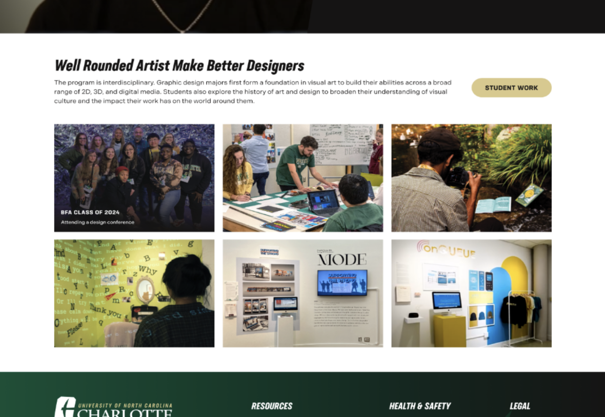
The example below shows the Image Card in use, along with the selected configuration options.
- Block Heading:
- Show Block Heading: Yes
- Eyebrow Text (optional): This is eyebrow text
- Title (optional): Image Gallery
- Description (optional): Lorem ipsum dolor sit amet, consectetur adipiscing elit…
- Button Color: Gold
- Block Options:
- Layout: Grid
- Columns: 3
- Image Aspect Ratio: 1:1
- Background Color: White
Image Gallery
Lorem ipsum dolor sit amet, consectetur adipiscing elit, sed do eiusmod tempor incididunt ut labore et dolore magna aliqua.
-

Pop Martin
-
Serviceman
-

Scientist in the Lab
-
Students with Norm
-

Man Smiling
-

WP Test