Link Lists
A link lists component serves as a way to organize and display lists of related content in a structured and interconnected manner. It offers functionality for easy navigation and management of large groups of information.
When To Use This Component
This component should be used when you want to present multiple links in a clear, organized, and scannable format. This component is ideal in situations where users need to navigate through a large number of related pages, documents, or external resources. By grouping links together, the Link List Block helps users quickly find what they are looking for while providing context by showing connections between related content.
USE CASES OR SCENARIOS
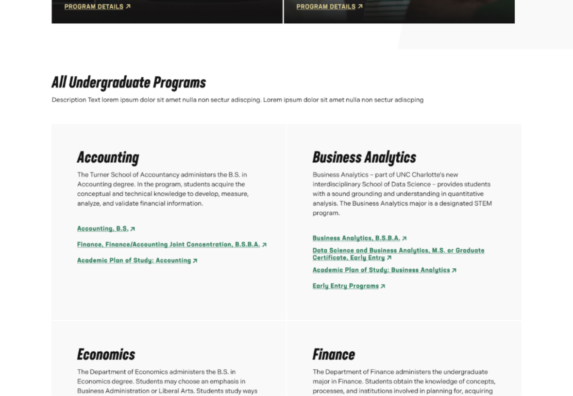
- Linking out to specific majors, and academic plans of studies and their respective pages, grouped by study area.
- Providing students easily accessible links to campus resources.
Component Do’s & Don’ts
There might be a time when you don’t know whether to use a Link List component or not. Here are some examples of how to effectively use a Link List component and when you shouldn’t use one:
DO
When using the Link List Block, it’s important to organize links logically by topic, category, or purpose to make them easy for users to scan and navigate. Each link should have descriptive text that clearly communicates what users will find when they click, avoiding vague labels that could cause confusion. Keep the number of links manageable to prevent overwhelming users, and use a clear visual hierarchy to highlight the most important links without cluttering the list. Finally, regularly review and update the links to ensure they remain current, relevant, and useful for your audience.
DON’T
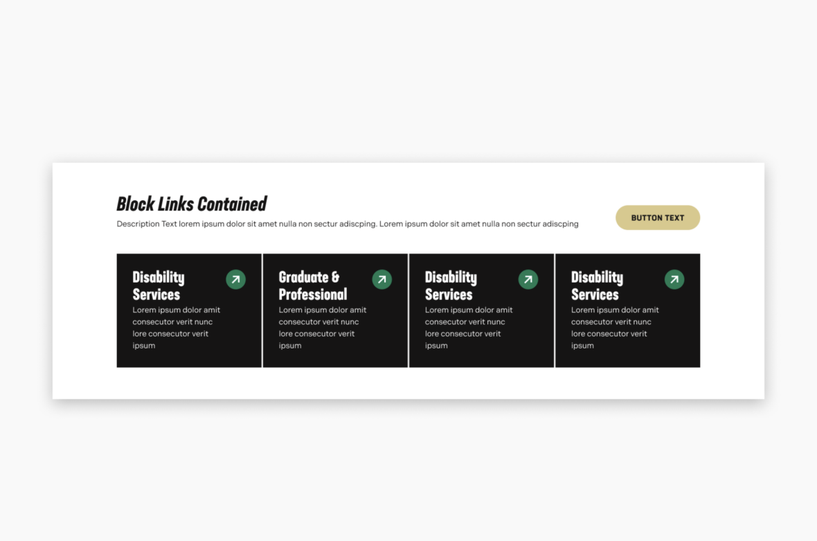
When using the Link List Block, avoid vague labels such as “Click here” or “Read more” without context, as they do not clearly communicate the destination of the link. Do not overload the list with too many links, since an excessive number of options can overwhelm or confuse users. Keep links relevant to the same topic or theme and avoid mixing unrelated content, ensuring that users can easily understand the purpose of the list. Make sure important links are easy to find and not hidden among less critical items. Additionally, if you only need to link to a few pages or resources (fewer than eight), it is better to use the Block Links component instead of the Link List Block for a cleaner, more appropriate presentation.
Component Design Options
Below are the Link List component design options, with explanations of each and guidance on proper usage.
EDITABLE PARTS:
- Block Heading:
- Show Block Heading: Option to turn off or on the header.
- Eyebrow Text (optional): An eyebrow text is a small line of text that appears above the title. Its purpose is to provide context, category information, or a subtle introduction to the main heading without drawing as much attention as the headline itself.
- Title (optional): A header title should clearly convey the blocks main topic, be visually prominent, and guide visitors through the content while maintaining readability and accessibility.
- Description (optional): The description provides a brief, clear summary that supports the header title and helps visitors quickly understand the block content.
- Button (optional): The button prompts users to take a specific action. Its text should be short, clear, and compelling, and the linked URL must be correct and active to ensure users reach the intended destination.
- Button Color: Green, Gold
- Block Options:
- Background Color: Gray, Black, White (For ADA Compliance, the colors you choose will alter the card color)
- Card Color: Gray, Black, White (For ADA Compliance, the colors you choose will alter the background color)
- Link List Box:
- Title (optional): The title should clearly communicate the block’s primary topic. Keep titles concise, focused and short.
- Description (optional): The description provides a brief, clear summary that supports the CTA title and helps visitors quickly understand the block content.
- Link (optional): The button prompts users to take a specific action. Its text should be short, clear, and compelling, and the linked URL must be correct and active to ensure users reach the intended destination.
The example below shows the Link List in use, along with the selected configuration options.
- Block Heading:
- Show Block Heading: Yes
- Eyebrow Text: This is Eyebrow Text
- Title: Link Lists Example
- Description: Lorem Ipsum is simply dummy text of the printing and typesetting industry.
- Block Options:
- Background Color: White
- Card Color: Gray
This is Eyebrow Text
Link Lists Example
Lorem Ipsum is simply dummy text of the printing and typesetting industry.