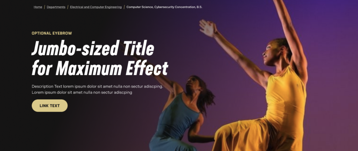
- Eyebrow label (optional)
- Page title
- Description text (optional)
- Image
- Button (optional)
- Hide/show breadcrumbs

The page header serves as the first point of orientation, introducing the content and purpose of a page while helping users quickly understand that they are in the right place. Its design can vary depending on the page’s goal, ranging from high-impact marketing pages to simple utility pages and can be styled to reflect that purpose. Some headers may feature bold visuals and messaging to capture attention, while others may present a clean, straightforward page title for clarity. Regardless of the format, page headers are a crucial element in guiding the user experience and setting the tone for the content that follows.
Page headers appear once per page and are always positioned as the first component. They should be used when you want to clearly introduce the content and purpose of a page, helping users immediately understand where they are and what the page is about. By establishing context right at the top, page headers set the tone for the content that follows and guide the overall user experience.
USE CASES OR SCENARIOS
There is really only one time to use a Page Header component, and that is once per page, at the top of your page. Here are some things to keep in mind when using a Page Header component on your page.
DO
When creating a page header, ensure its purpose is clear by communicating what the page is about. Match the design to the page’s goal, using bold visuals for marketing or feature pages and simple titles for utility pages. Maintain consistency in placement and structure across similar pages, and prioritize readability with clear typography, good contrast, and sufficient spacing. Include supporting elements, such as subheadings, taglines, or visuals, to reinforce the page’s purpose, and balance text with images carefully. Use a succinct page title and short description, and choose photos with a right-side focal point to make the text easier to read and create a visually compelling composition. Additionally, always include descriptive alt text for header images to ensure accessibility for all users.

DON’T
Avoid placing too much text in your page header. This space is meant to introduce the page’s content, not to display everything at once. Choose images with a left-side focal point so the text remains readable and visually balanced. Too much text can make the header feel crowded, and in the worst case, it may obscure the main subject of your image.

Below are the Page Header component design options, with explanations of each and guidance on proper usage.
EDITABLE PARTS:
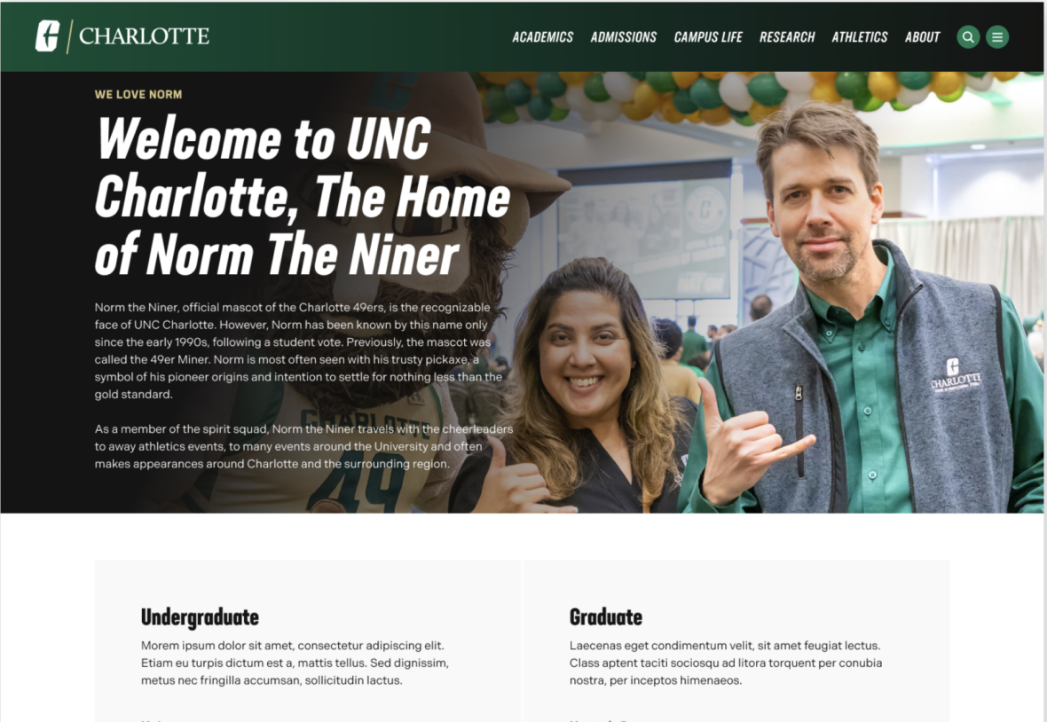
The example below shows the Page Header in use, along with the selected configuration options.


