Slider Card
A slider block allows you to display multiple images or content slides that users can navigate through, typically used for showcasing featured content, student highlights and featured faculty.
It works by adding individual slides within a block, where each slide can contain text, images and CTA Buttons.
When To Use This Component
Use the Slider Block when you need to showcase multiple pieces of related, high-priority content within a limited amount of space. This component is well suited for visually engaging storytelling and highlighting featured content without overwhelming the page layout.
USE CASES OR SCENARIOS
- Highlighting featured programs, initiatives, or announcements
- Showcasing student stories, faculty profiles, or alumni highlights
- Displaying rotating promotional content on landing pages
- Presenting image-forward content that benefits from sequential viewing
Component Do’s & Don’ts
There might be a time when you don’t know whether to use a Slider Card component or not. Here are some examples of how to effectively use a Slider Card component and when you shouldn’t use one:
DO
Limit the number of slides to keep the experience focused and easy to navigate, and ensure that each slide has a clear purpose and communicates a single, concise message. Use high-quality images that align with university brand standards, and keep text brief and readable so users can quickly understand the content. CTA buttons should be used intentionally and link to clear, relevant next steps. Maintain consistency across all slides in layout, tone, and structure to create a cohesive experience, and ensure the slider is accessible by using descriptive text and keyboard navigation where supported.
DON’T
Avoid overloading slides with too much text and do not use the slider to hide critical information that users need to see immediately. Keep the number of slides manageable, as too many can reduce engagement and make content harder to understand, and avoid mixing unrelated content within the same slider. Sliders should not be used on every page, and multiple slider components should not be stacked directly on top of each other.
Component Design Options
Below are the Slider Card component design options, with explanations of each and guidance on proper usage.
EDITABLE PARTS:
- Block Options:
- Layout: The Full Width layout stretches content across the entire page for a bold, immersive look, while the Grid layout confines content to aligned columns, creating a structured and consistent appearance.
- Background Color: Gray, White, Black
- Slides:
- Eyebrow Text (optional): An eyebrow text is a small line of text that appears above the title. Its purpose is to provide context, category information, or a subtle introduction to the main heading without drawing as much attention as the headline itself.
- Title (optional): A header title should clearly convey the blocks main topic, be visually prominent, and guide visitors through the content while maintaining readability and accessibility.
- Description (optional): The description provides a brief, clear summary that supports the header title and helps visitors quickly understand the block content.
- Button: The button prompts users to take a specific action. Its text should be short, clear, and compelling, and the linked URL must be correct and active to ensure users reach the intended destination.
The example below shows the Slider Component in use, along with the selected configuration options.
- Block Options:
- Layout: Full Width
- Background Color: Gray
- Slides
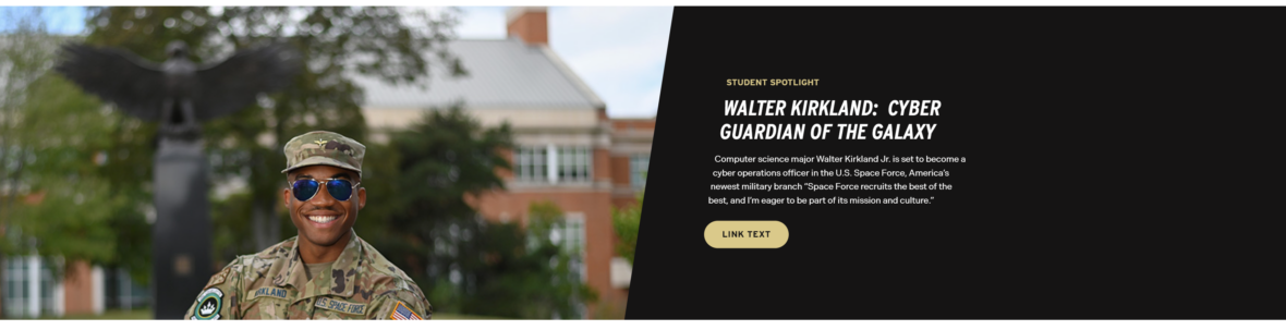
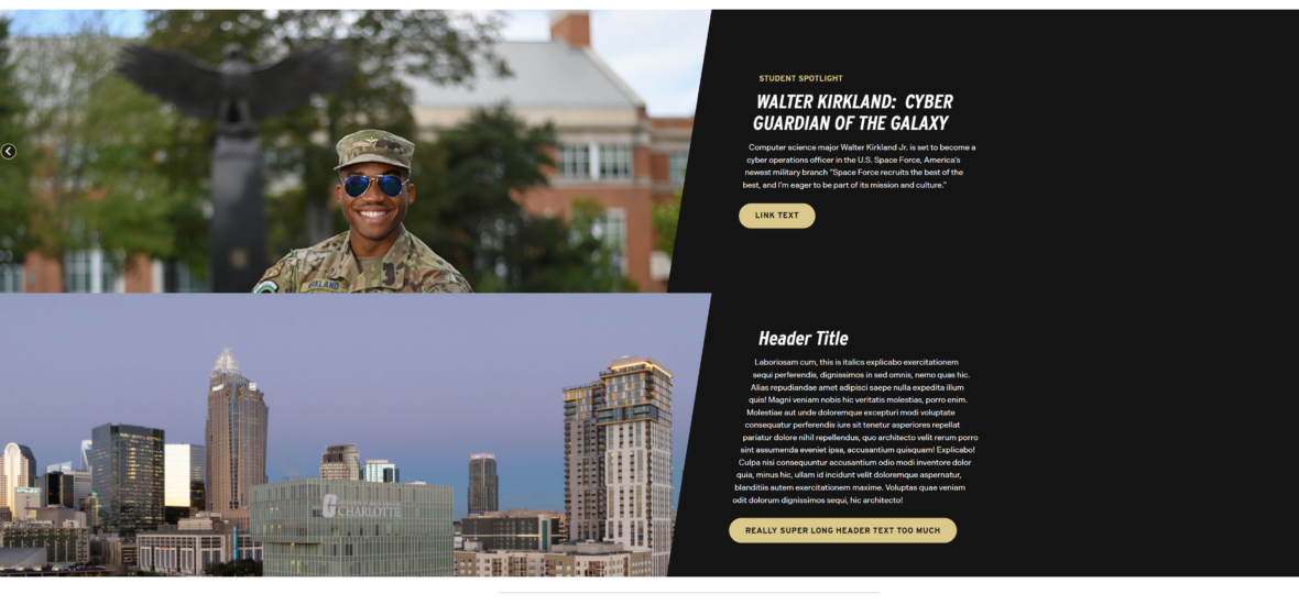
- Eyebrow Text (optional): Student Spotlight
- Title: Walter Kirkland: Cyber Guardian of the Galaxy
- Description (optional): Computer science major Walter Kirkland Jr. is set to become…
- Button (optional): URL: Example Link Text: Read More
-
 STUDENT SPOTLIGHT
WALTER KIRKLAND: CYBER GUARDIAN OF THE GALAXY
Computer science major Walter Kirkland Jr. is set to become a cyber operations officer in the U.S. Space Force, America’s newest military branch “Space Force recruits the best of the best, and I’m eager to be part of its mission and culture.”
-
STUDENT SPOTLIGHT
DHAIRYA DESAI: PREPPING FOR A POSITIVE IMPACT IN MEDICINE
Dhairya Desai, a third-year pre-med Levine Scholar at UNC Charlotte, balances rigorous academics with impactful community service. Pursuing dual degrees in Chemistry and Biology, he’s engaged in groundbreaking research and leads initiatives to improve public health.