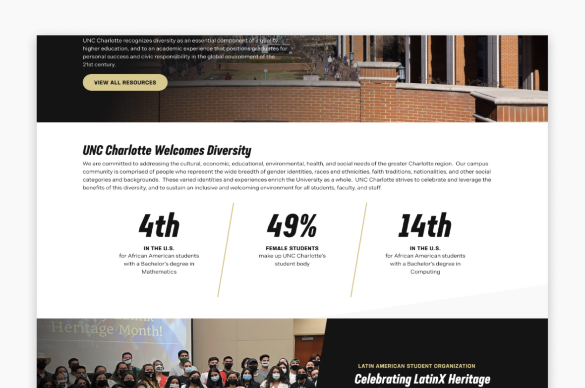
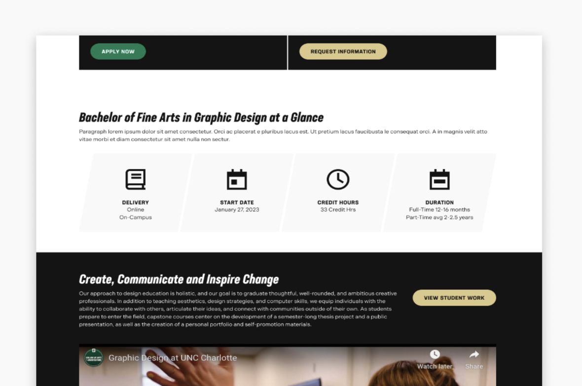
Statistic Cards (Stat Card)
A statistics card component acts as a versatile and visually appealing feature to present numerical data in a concise and engaging format on your pages. Whether you’re showcasing graduation and academic performance metrics, student demographics data, or any other quantitative information, the statistics card component offers a clear and structured way to convey important data points to your users.
When To Use This Component
This component should be used when you want to prominently display numerical data or facts related to the page information. This component is especially effective when you want users to quickly grasp key facts without reading lengthy explanations.
USE CASES OR SCENARIOS
- Showcase enrollment and demographics statistics like diversity metrics, international student percentages, and student-to-faculty ratios.
- Present financial aid and scholarship information like financial aid distribution, scholarship availability and average financial aid packages.
Component Dos & Don’ts
There might be a time when you don’t know whether to use a statistics card component or not. Here are some examples of how to effectively use a statistics card component when you shouldn’t use one:
DO
Use the statistics card component when you want to feature data or facts whose numerical values are the most important part. Use clear, accurate data that supports your message and provides value to your audience. Keep numbers simple and easy to scan, pairing them with short, descriptive labels for context. Maintain consistency in formatting and styling to ensure the cards look cohesive across the page. Regularly review and update statistics to ensure the information remains current and trustworthy.

DON’T
Avoid overcrowding the card with too many numbers or excessive text, as this can reduce readability. Don’t use unclear labels or unexplained acronyms that may confuse users. Avoid presenting outdated or unverified data, as this can undermine credibility. Don’t use the statistic card for information that would be better communicated through detailed tables, charts, or long-form content. If the information you want to present isn’t mostly numerical, consider using a component like the icon cards.

Component Design Options
Below are the Statistic Card component design options, with explanations of each and guidance on proper usage.
EDITABLE PARTS:
- Block Heading:
- Show Block Heading: Option to turn off or on the header.
- Eyebrow Text (optional): An eyebrow text is a small line of text that appears above the title. Its purpose is to provide context, category information, or a subtle introduction to the main heading without drawing as much attention as the headline itself.
- Title (optional): A header title should clearly convey the blocks main topic, be visually prominent, and guide visitors through the content while maintaining readability and accessibility.
- Description (optional): The description provides a brief, clear summary that supports the header title and helps visitors quickly understand the block content.
- Button (optional): The button prompts users to take a specific action. Its text should be short, clear, and compelling, and the linked URL must be correct and active to ensure users reach the intended destination.
- Button Color: Green, Gold
- Block Options
- Background Color: Gray, Black, White
- Card Layout: 2-Up, 3-Up, 4-Up. How many cards appear per row based on the desired visual balance and available page space.
- Stat Card Item:
- Stat: Use clear, short and accurate data that supports your message and provides value to your audience.
- Title (optional): The title should clearly communicate the block’s primary topic. Keep titles concise, focused and short.
- Description (optional): The description provides a brief, clear summary that supports the CTA title and helps visitors quickly understand the block content.
- Link (optional): The button prompts users to take a specific action. Its text should be short, clear, and compelling, and the linked URL must be correct and active to ensure users reach the intended destination.
The example below shows the Statistic Card in use, along with the selected configuration options.
- Block Heading:
- Show Block Heading: Yes
- Title: Header Title
- Description: Lorem ipsum dolor sit amet consectetur, adipisicing elit…
- Button (optional): URL: Example Link Text: Button Title
- Button Color: Gold
- Block Options:
- Background Color: Black
- Card Layout: 3-Up
Header Title
Lorem ipsum dolor sit amet consectetur, adipisicing elit. Perspiciatis tenetur vero aut sit ducimus nulla perferendis!