Main Landing Page
A primary landing page serves as a high-level entry point into a website or major section. It is often the first page users encounter when navigating to a department, program, initiative, or campaign. Because of this, it plays a critical role in shaping first impressions, establishing credibility, and guiding users toward meaningful action.
Unlike interior content pages, a primary landing page is strategic. It is designed to:
- Clearly communicate who you are and what you offer
- Provide a concise overview of key information
- Highlight priority messages or initiatives
- Direct users to the most important next steps
- Support recruitment, engagement, or conversion goals
A well-structured primary landing page reduces friction by organizing content into purposeful sections that guide users logically from introduction to action. Each content block serves a specific function, whether it’s building awareness, reinforcing value, providing proof points, or prompting engagement.
Consistency in structure and design across primary landing pages also strengthens the university’s digital presence. When editors follow a shared framework, users benefit from a predictable, intuitive experience regardless of which department or program they visit.
Page Header: Large Header Option Required for Primary Landing Pages
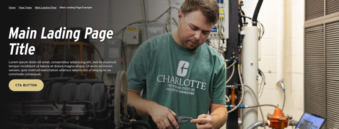
The page header is the first and most important visual element on your landing page. It immediately orients visitors, confirms they are in the right place, and sets expectations for what the page will deliver. A strong header establishes clarity, purpose, and tone within seconds.
Because primary landing pages serve as key entry points to your site, they must use the Large Header option. The Large Header provides the visual impact and hierarchy needed to:
- Clearly communicate the page’s purpose
- Establish a strong first impression
- Support strategic messaging with space for compelling headlines
- Reinforce branding and visual consistency
- Create a structured starting point for the content that follows
Primary landing pages are not utility pages — they are high-visibility destinations. The Large Header ensures your content begins with confidence, clarity, and appropriate visual weight.
Always select the Large Header for main landing pages to maintain consistency across the university’s web experience and to support strong user orientation and engagement.
Block Link Cloud
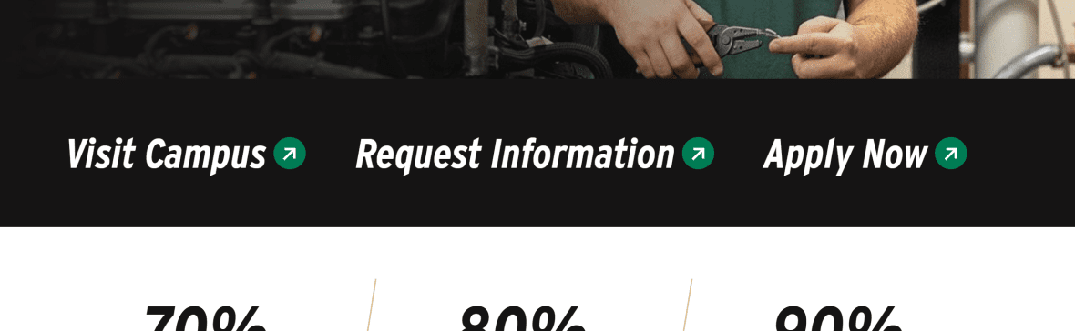
The Block Link Cloud is designed to highlight a small set of high-priority links — ideally between 2 and 4 — that users need quick access to. This component gives those links visual prominence, helping them stand out from surrounding content and making them easier to scan and select.
Use the Block Link Cloud when you want to:
- Surface key related pages or resources
- Group similar or complementary content
- Provide quick pathways to high-demand information
- Reduce friction by shortening the path to common tasks
Because primary landing pages act as navigation hubs, the Block Link Cloud helps guide users deeper into your site in a clear and intentional way. It reinforces page structure by contextualizing related content, ensuring visitors can easily move from overview information to more detailed pages.
Avoid overcrowding this component. Its strength comes from focus and clarity. Limiting it to 2–4 thoughtfully chosen links maintains visual impact and ensures each link serves a strategic purpose.
When used correctly, the Block Link Cloud improves usability, supports user flow, and strengthens the overall navigation experience of your landing page.
Statistic Card
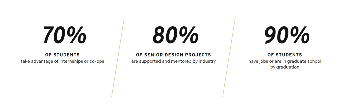
The Statistic Card component is used to highlight key data points in a way that is clear, concise, and visually impactful. Numbers naturally draw attention, and when presented intentionally, they can quickly communicate credibility, scale, and success.
On a primary landing page, statistic cards help reinforce your message with measurable proof. Whether you are showcasing enrollment numbers, graduation rates, rankings, research funding, student outcomes, or other performance metrics, this component allows users to absorb important information at a glance.
Use the Statistic Card component to:
- Emphasize institutional strengths or achievements
- Provide data that supports your value proposition
- Break up text-heavy sections with visual interest
- Build trust through transparent, quantifiable information
Statistic cards are most effective when the data is relevant, current, and meaningful to your audience. Avoid overwhelming users with too many numbers — select the metrics that best align with your page goals and overall messaging.
When used strategically, the Statistic Card component strengthens your narrative by pairing compelling content with tangible evidence.
Image Card
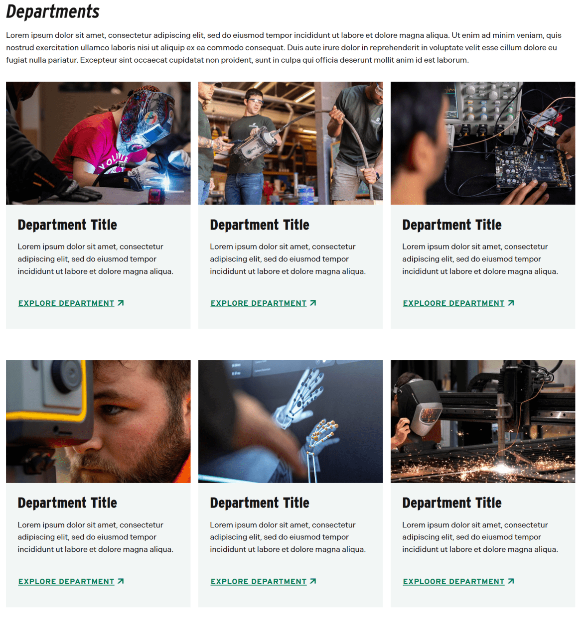
The Image Card component is a flexible, visually engaging way to direct users to related content while adding strong visual structure to your landing page. Designed to feature 2 to 4 linked items, it combines imagery and concise text to create clear, scannable pathways deeper into your site.
On a primary landing page, Image Cards help transform lists of links into purposeful visual navigation. Because the component is fully manual, editors have control over imagery, headlines, descriptions, and layout, allowing content to be tailored to the specific goals of the page.
Use the Image Card component to:
- Highlight related departments, programs, services, or initiatives
- Create a structured, visually balanced section of featured content
- Encourage exploration through clear, attractive link groupings
- Showcase people, spaces, or experiences using strong imagery
The circular image style can be especially effective when featuring individuals (such as faculty, students, or leadership), while standard image formats work well for programs, departments, or thematic content.
As with other featured link components, focus is key. Limiting the set to 2–4 thoughtfully selected items maintains clarity and impact. When used strategically, Image Cards enhance visual hierarchy, improve scannability, and guide users naturally to the next step in their journey.
Section Block
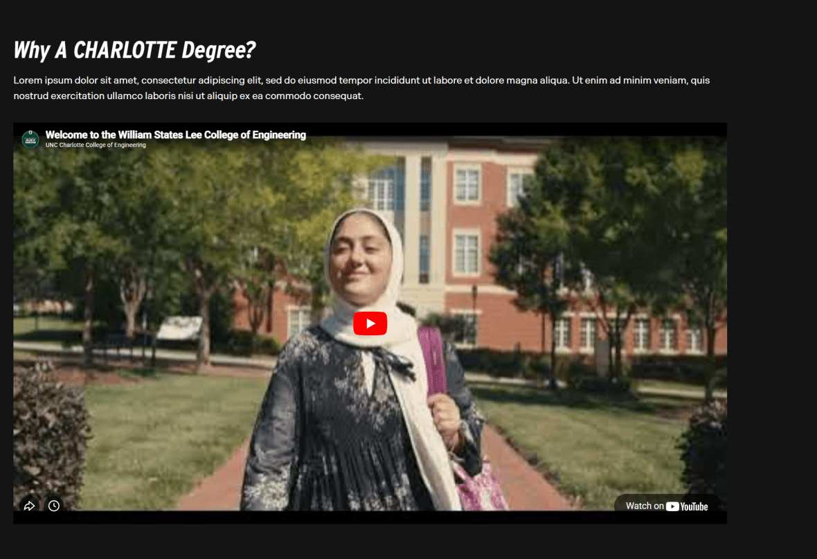
The Section Block component is used to visually group related content and create clear separation between major areas of a page. On a primary landing page, this structure is essential for guiding users through content in a logical, organized way.
Rather than presenting information as one continuous stream, the Section Block introduces visual rhythm and hierarchy. Through the use of background color, imagery, or video, it signals a shift in focus and helps users quickly understand that they are entering a new topic or priority area.
Use the Section Block to:
- Highlight key messages, initiatives, or featured content
- Break long pages into scannable, digestible sections
- Emphasize important calls to action such as “Apply Now” or “Learn More”
- Provide supporting or contextual information
- Showcase media, such as a featured video
In the example primary landing page, the Section Block is used to feature a college video — giving it dedicated space and visual emphasis so it stands out from surrounding content.
When used strategically, the Section Block improves readability, strengthens visual hierarchy, and ensures that high-priority content receives the attention it deserves. It helps create a structured, engaging experience that moves users naturally from one section of the page to the next.
Slider
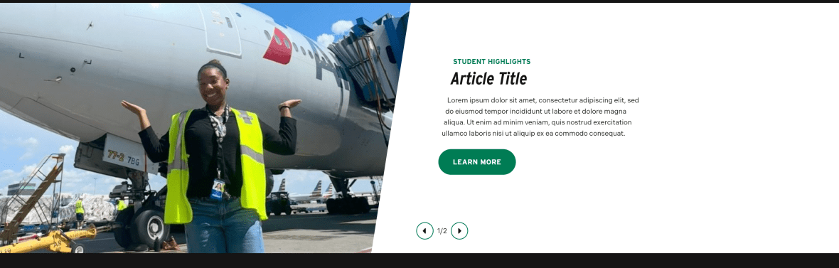
The Slider Block is designed to showcase multiple pieces of related, high-priority content within a single, compact space. It allows you to feature dynamic or image-forward content without overwhelming the page layout, making it especially effective on primary landing pages where space and hierarchy matter.
This component supports storytelling by presenting content sequentially. Rather than listing multiple items vertically, the slider creates an interactive experience that encourages users to engage with featured programs, stories, or announcements one at a time.
Use the Slider Block to:
- Highlight featured programs, initiatives, or campaigns
- Showcase student success stories, faculty profiles, or alumni highlights
- Display rotating promotional or editorial content
- Present visually driven content that benefits from focused attention
On the example primary landing page, the Slider Block is used to highlight Student Success stories and related articles. This approach keeps the section visually engaging while reinforcing the college’s impact through narrative-driven content.
When used thoughtfully, the Slider Block adds movement and variety to your page, supports promotional priorities, and allows you to feature multiple high-value items without sacrificing clarity or structure.
Image Card
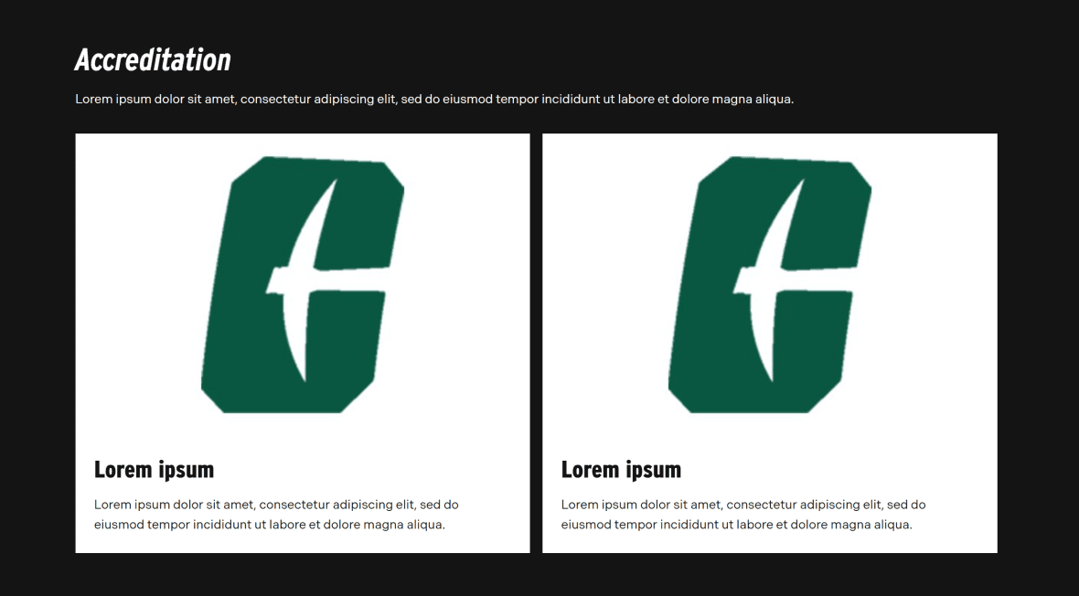
The Image Card component is a flexible, visually engaging way to direct users to related content while adding strong visual structure to your landing page. Designed to feature 2 to 4 linked items, it combines imagery and concise text to create clear, scannable pathways deeper into your site.
On a primary landing page, Image Cards help transform lists of links into purposeful visual navigation. Because the component is fully manual, editors have control over imagery, headlines, descriptions, and layout, allowing content to be tailored to the specific goals of the page.
Use the Image Card component to:
- Highlight related departments, programs, services, or initiatives
- Create a structured, visually balanced section of featured content
- Encourage exploration through clear, attractive link groupings
- Showcase people, spaces, or experiences using strong imagery
Because primary landing pages often serve prospective students, families, and partners, establishing credibility is essential. Featuring accreditations through Image Cards gives these distinctions appropriate visual weight and ensures they are noticed.
As with other uses of the Image Card component, keep the selection focused and purposeful. Choose the recognitions that are most meaningful to your audience and align with your page’s goals.
When used strategically, Image Cards strengthen trust, enhance visual organization, and support your overall value proposition.
Post Cards
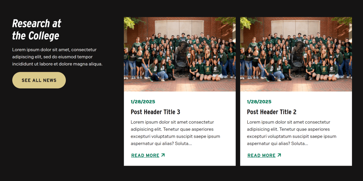
The Post Cards block is designed to keep your landing page dynamic by showcasing timely, relevant content in a structured and visually engaging format. It highlights multiple updates, such as news, announcements, blog posts, or events, while maintaining clarity and organization.
On a primary landing page, this component plays an important role in demonstrating activity and momentum. Fresh content signals that your department or program is engaged, current, and actively contributing to the university community.
Use the Post Cards block to:
- Feature recent news, announcements, or stories
- Provide a quick overview of multiple updates at a glance
- Encourage users to explore full articles or event details
- Keep landing pages feeling current and regularly refreshed
The card-based layout makes content easy to scan, allowing users to quickly identify items of interest without being overwhelmed by long lists of links or full-text articles.
When used strategically, the Post Cards block strengthens engagement, supports storytelling, and reinforces the vitality of your program or department by consistently surfacing relevant, up-to-date content.
Image Gallery
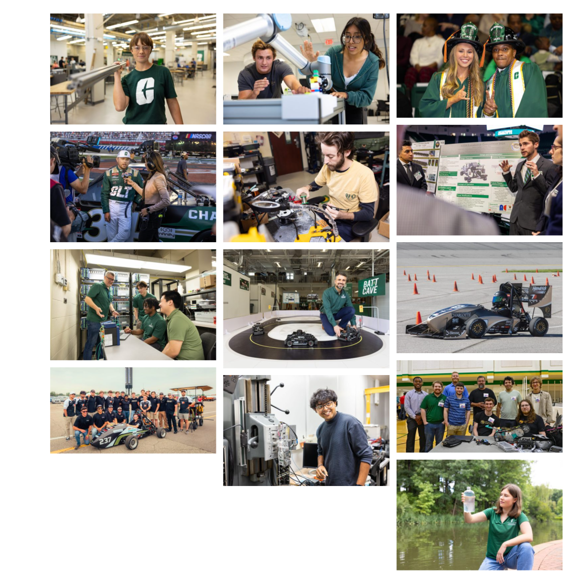
The Image Gallery component provides a structured way to present a collection of related images in a clean, organized grid or masonry-style layout. On a primary landing page, it helps bring your content to life by adding visual depth and authentic context.
While individual images can support specific sections, the Image Gallery allows you to tell a broader visual story. With the ability to display up to 24 images, this component is ideal for showcasing environments, experiences, and moments that reflect the identity and energy of your department or program.
Use the Image Gallery to:
- Highlight campus life, facilities, or events
- Showcase student work, labs, classrooms, or research spaces
- Share photos from conferences, ceremonies, or workshops
- Provide visual context that strengthens written content
Images are powerful tools for engagement. They help prospective students, families, and partners envision themselves within your community. When thoughtfully curated, an image gallery can communicate culture, scale, and experience in ways text alone cannot.
To maintain impact, ensure that all images are high quality, thematically connected, and aligned with the page’s overall message. When used intentionally, the Image Gallery enhances storytelling, builds connection, and creates a more immersive and compelling landing page experience.