The Overview Page is a second-level navigational hub within a section of the website. It sits beneath a Section Landing Page and serves as both:
A gateway to third-level child pages, and
A context-setting content page that begins introducing more detailed information.
Unlike a Section Landing Page, which is designed to guide users to broad audience categories, the Overview Page begins narrowing the focus. It bridges high-level navigation and deeper, topic-specific content.
Purposes and Uses
Providing Context: Introduces the subject area and confirms users are in the right place.
Organizing Related Content: Groups and surfaces third-level pages in a clear, structured way.
Supporting Wayfinding: Acts as a menu page within the content hierarchy, reducing reliance on global navigation.
Guiding Next Steps: Funnels users toward deeper, more detailed pages aligned with their intent.
Example Overview Page Breakdown
In this guide, we will use the First‑Year Students page on the UNC Charlotte Undergraduate Admissions website as a model for best practices in building an Overview Page. Specifically, we will reference this page as an example of strong structure, clarity, and user-focused design.
Rather than overwhelming users with detailed application requirements immediately, the page first establishes context, clearly communicating that this is the starting point for prospective students navigating the first-year application process.
From there, the page strategically funnels users into distinct, clearly labeled pathways based on the stages of the application journey. Through structured content blocks and action-oriented links, visitors can quickly identify the path most relevant to them, such as:
Application Requirements
Admission Review
Receiving Your Decision
Each pathway includes concise descriptive language that explains what users will find on the next page. This approach reduces confusion, supports decision-making, and ensures that users do not need to rely solely on the main navigation menu to move forward.
This example demonstrates several key best practices for Overview Pages:
Clear orientation: Provide a brief but meaningful introduction to the page topic.
Stage-based organization: Group content by logical user steps or workflow.
Scannable block layout: Use consistent visual structures to present child pages.
Action-oriented linking: Guide users toward next steps with purposeful language.
By modeling your Overview Pages after this approach, you help users quickly understand where they are, what options are available, and what action they should take next, ultimately improving usability, engagement, and conversion outcomes across your site.
Page Header: Medium Header Option Required for Overview Pages
The Page Header is the first component users encounter on the Overview Page. It introduces the page content and purpose, immediately orienting visitors and helping them understand where they are within the site hierarchy. By establishing context at the top of the page, the header sets the tone for the rest of the content and guides the overall user experience.
On Overview Pages like First‑Year Admissions, the Medium Header Option is recommended. This header is slightly smaller than the Large Header and does not include CTA buttons, keeping the focus on clear page context rather than prompting immediate actions. It provides a clean, user-focused introduction while allowing the content and associated child pages below to guide users naturally to the next steps.
The Header block is used to:
Orient users: Provide a clear starting point so visitors know they are in the correct section.
Set the tone: Communicate whether the page is informative, functional, or promotional through its messaging and visual style.
Highlight key information: Draw attention to the topic of the page, preparing users for the content that follows.
Maintain consistent UX: Create a recognizable entry point across Overview Pages, helping users navigate the site with confidence.
The Child Menu Block is a dynamic navigation component that automatically displays the sub-pages (or child pages) associated with the current page in the site’s hierarchy. By surfacing these links in a consistent, easy-to-scan format, the block helps users understand where they are within a section and provides clear pathways to explore deeper levels of content. Because the menu updates automatically based on your site structure, it eliminates the need to manually maintain links and ensures that users always see the most accurate child pages.
Strategically, the Child Menu Block is placed directly below the main page header. This location reinforces the hierarchy of the page: users first understand the purpose of the page through the header, then immediately see their options for exploring related content. This placement maximizes usability by providing contextual navigation at the moment it is most needed, guiding users efficiently toward relevant subtopics.
Within the Child Menu Block, Image Cards are included to highlight primary calls-to-action (CTAs) that are most relevant to the page’s audience. For the First-Year Students page, these CTAs, Request Information and Apply Now, were intentionally chosen based on the needs and goals of prospective first-year applicants. The visual emphasis of the image cards draws attention to these high-priority actions, encouraging users to engage with the most important next steps without overwhelming them with excessive choices.
Purpose and Strategic Value:
Enhances discoverability: Clearly presents all child pages for easy navigation.
Supports user orientation: Helps users understand their location within the site hierarchy.
Automates maintenance: Updates automatically as new child pages are added or existing pages are reorganized.
Maintains logical flow: Positioned immediately below the header to provide context-driven navigation at the top of the page.
By combining dynamic navigation with strategic CTAs, the Child Menu Block ensures users can both explore content efficiently and take meaningful actions aligned with their journey.
The Icon Card component is used in the Contact Us section to highlight key resources and services in a visually structured, easy-to-scan format. Each card combines an icon, a short title, and a brief description in a clean, clickable layout, breaking down complex information into clear, digestible pieces. On the First-Year Students page, the Icon Cards are used to surface ways for prospective students to connect with the Admissions team, ensuring users can quickly access the support they need.
Purpose of the Icon Card Component:
Facilitates quick access: Guides users to important contact resources without requiring them to scroll through dense text.
Supports user decision-making: Helps prospective students identify the most relevant point of contact based on their needs.
Enhances visual clarity: Combines text and iconography to create easily scannable, recognizable entry points.
Encourages engagement: Clickable cards invite users to take the next step, whether submitting a question, requesting information, or scheduling a visit.
Strategic Placement:
The Contact Us Icon Cards are positioned toward the bottom of the Overview Page, after users have explored the content and navigation pathways provided by the header and child menu blocks. This placement ensures that users are already oriented and informed before being prompted to reach out for support. By situating contact options at the end of the content flow, the page provides a natural next step for users who have questions or want personalized assistance, aligning with their decision-making process.
Overall, the Icon Card component combines visual appeal with functional clarity, making it an effective tool for supporting users, highlighting essential resources, and maintaining a consistent, user-friendly design across the site.
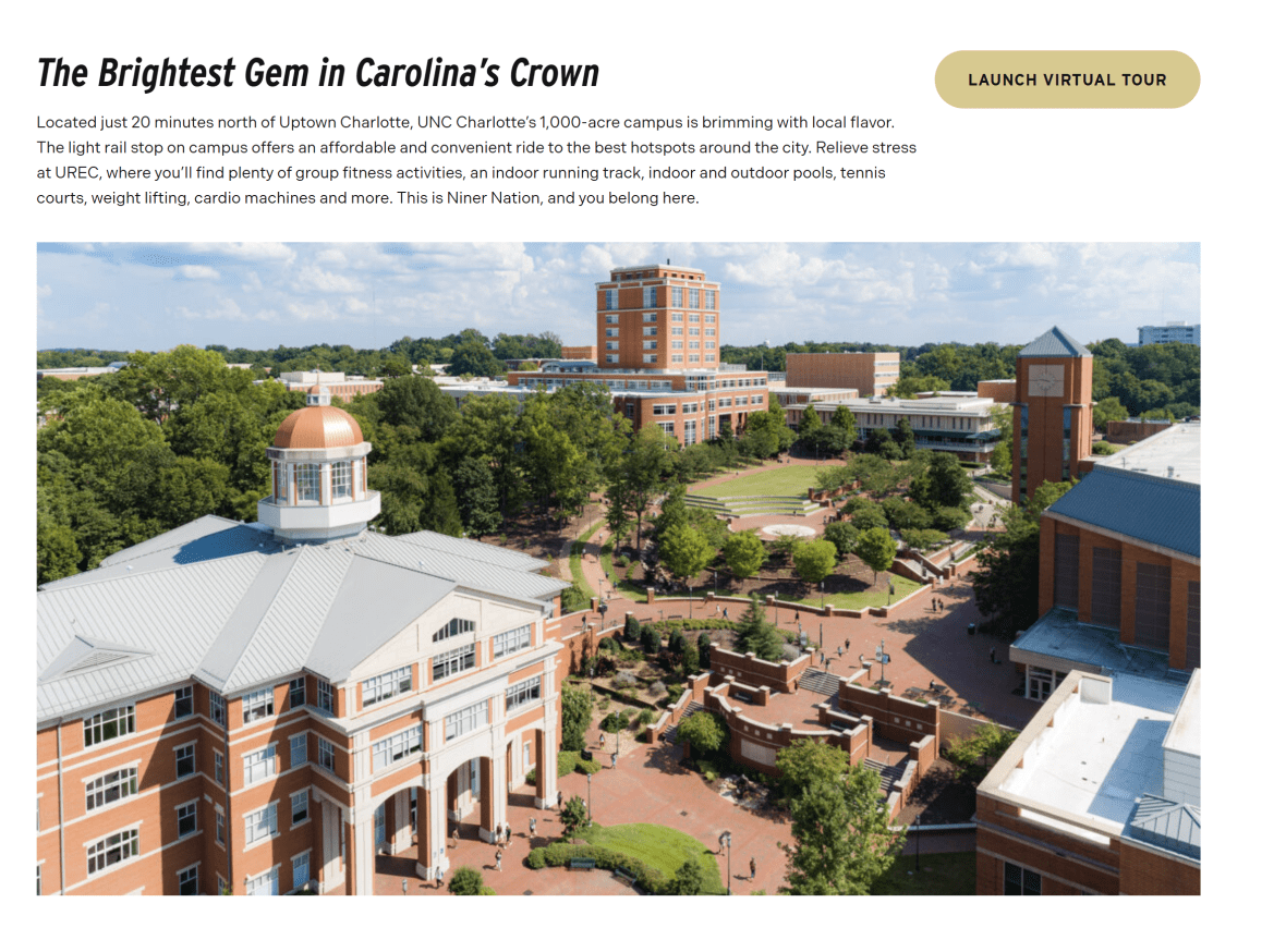
The Section Block is used to visually group related content and create clear separation from other areas of the page. On the First-Year Students Overview Page, this block highlights a primary call-to-action (CTA) encouraging prospective students to take a virtual tour of the campus, accompanied by a large, engaging graphic of the campus. By creating a dedicated, visually distinct area, the section draws attention to this important action while maintaining a clean and organized page layout.
Purpose of the Section Block:
Highlight key actions or messages: Surfaces important opportunities, such as scheduling a virtual tour, so they are prominent and engaging.
Break up content for scannability: Separates this CTA from surrounding content to prevent visual clutter and guide the user’s eye.
Provide contextual information: Reinforces the campus experience and supports users in understanding the value of the CTA.
Establish visual hierarchy and rhythm: Uses background color, imagery, or media to create emphasis and enhance overall page design consistency.
Strategic Placement:
The section is placed mid-page, after users have explored the header, child menu, and introductory content. This location ensures that users are already oriented and familiar with the page’s purpose before being invited to engage with the highlighted CTA. By positioning it prominently but not at the very top, the Section Block balances visibility with context, encouraging interaction while keeping the content flow natural and user-focused.
Overall, the Section Block effectively guides users to meaningful actions, reinforces key messaging, and provides a visually appealing break that enhances usability and engagement across the page.
The Simple Call to Action (CTA) Block is designed to highlight a single, focused action in a clean and straightforward way. On the First-Year Students Overview Page, this block draws attention to the digital publications, allowing users to easily download multiple PDF brochures containing admissions information. By emphasizing one clear action, the block ensures users can quickly access important resources without distraction.
Purpose of the Simple CTA Block:
Promote a single action: Guides users to a key resource, in this case, the downloadable admissions brochures.
Simplify user decisions: Focuses attention on one important next step, reducing cognitive load.
Highlight key resources: Makes it easy for users to access essential content or documents.
Support announcements or updates: Can also be used for time-sensitive materials or new resources in other contexts.
Strategic Placement:
The Simple CTA Block is positioned after the main content and navigation sections, ensuring users have already oriented themselves and explored the core information before being prompted to take the action. This placement provides context for the CTA, so users understand why the resource is relevant and are more likely to engage. Its clean, standalone layout ensures the action is visually prominent without competing with other content on the page.
Overall, the Simple Call to Action Block provides a focused, user-friendly way to drive engagement, making it an ideal component for promoting a single, high-priority action or resource within the page flow.
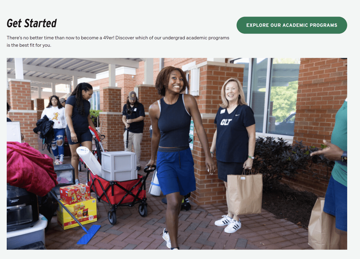
The Section Block at the bottom of the First-Year Students Overview Page is used to visually group related content and provide a clear, distinct area for a primary call-to-action (CTA). In this case, the block encourages prospective undergraduate students to explore the undergraduate programs at UNC Charlotte by linking directly to the Academics site. By creating a dedicated section, this block draws attention to an important next step while maintaining a consistent and organized page layout.
Purpose of the Section Block:
Highlight key actions or initiatives: Focuses user attention on the next logical step in the student journey — exploring undergraduate programs.
Break up content for scannability: Provides a visually distinct section at the end of the page to separate the CTA from other content.
Provide context for the CTA: Reinforces why this action is relevant and aligns it with the user’s decision-making process.
Establish visual hierarchy and rhythm: Uses layout, background styling, or imagery to create emphasis and maintain page design consistency.
Strategic Placement:
Positioned at the bottom of the page, this Section Block serves as the final action point for users who have reviewed the page content and navigation options. Its location ensures that users are fully oriented and informed before being prompted to take the next step. By placing a prominent CTA at the end of the content flow, the block guides users naturally to continue their journey into academic program exploration, while visually standing out as a clear, actionable endpoint.
Overall, the “Get Started” Section Block effectively bridges informational content with actionable next steps, providing a clear, visually distinct prompt for users to continue engaging with the site.
This concludes the walkthrough of the Overview Page Guide. To see all of these components in action and explore a fully built page, click here to view the complete First-Year Students Overview Page example.


