A Section Landing Page is a parent-level page linked in the top navigation that introduces a major section of your website and organizes its key destination pages in a clear, user-friendly way. Rather than acting as a standalone content page, its primary role is to help users orient themselves within a topic and direct them efficiently to more specific content deeper in the site.
Purpose and Uses
Provide Context: It should give users a clear sense of what the section covers, including who it’s for, what they can do there, and why it matters.
Organize Multiple Child Paths: Rather than leaving users to guess where to go next, the page groups child pages into intuitive options, such as pathways for first-year students, transfer students, and international applicants, with descriptions and call-to-action buttons.
Support Decision-Making: These pages help users quickly determine the best next step based on their status or needs.
Boost Usability: Especially in complex websites with lots of related content, Section Landing Pages reduce friction and make navigation clearer, improving user satisfaction and helping achieve institutional goals like inquiries and conversions.
Example Section Landing Page Breakdown
In this guide, we will use the Undergraduate Admissions website as a model for best practices in building a Section Landing Page. Specifically, we will reference the Apply to Charlotte page on UNC Charlotte Undergraduate Admissions as an example of strong structure, clarity, and user-focused design.
The Apply to Charlotte page serves as a central overview of the admissions process. Rather than overwhelming users with detailed requirements immediately, the page first establishes context—clearly communicating that this is the starting point for prospective students ready to begin their application journey.
From there, the page strategically funnels users into distinct, clearly labeled pathways based on applicant type. Through structured content blocks and action-oriented links, visitors can quickly identify the path most relevant to them, such as:
First-year applicants
Transfer students
International students
Other applicant categories
Each pathway includes concise descriptive language that explains who the content is for and what users will find on the next page. This approach reduces confusion, supports decision-making, and ensures that users do not need to rely solely on the main navigation menu to move forward.
This example demonstrates several key best practices for Section Landing Pages:
Clear orientation: Provide a brief but meaningful introduction to the section.
Audience-based organization: Group content by user type or task.
Scannable block layout: Use consistent visual structures to present child pages.
Action-oriented linking: Guide users toward next steps with purposeful language.
By modeling your Section Landing Pages after this approach, you help users quickly understand where they are, what options are available, and what action they should take next—ultimately improving usability, engagement, and conversion outcomes across your site.
Page Header: Large Header Option Required for Section Landing Pages
The page header is the first and most important visual element on your Section Landing Page. It immediately orients visitors, confirms they are in the correct section of the site, and establishes expectations for the content and pathways that follow. A strong header communicates clarity, purpose, and tone within seconds.
Because Section Landing Pages function as parent pages within the top navigation and serve as primary entry points into a major content area, they must use the Large Header option.
The Large Header provides the visual hierarchy and prominence necessary to:
Clearly define the section’s purpose
Establish immediate user orientation within the site structure
Create a strong first impression for high-traffic destinations
Support strategic messaging with space for clear, compelling headlines
Reinforce institutional branding and visual consistency
Provide a confident and structured starting point for the section overview
Section Landing Pages are not secondary or utility pages. They are high-visibility gateways that guide users into deeper content areas. The Large Header ensures the section begins with appropriate emphasis and clearly signals that the page represents a major category within the university website.
To maintain consistency across the university’s web ecosystem and to support intuitive navigation, web editors should always select the Large Header when building a Section Landing Page. This standard strengthens user orientation, enhances engagement, and reinforces a cohesive digital experience.
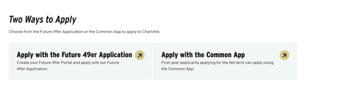
On the Apply to Charlotte Section Landing Page, the “Two Ways to Apply” section demonstrates a strategic and effective use of the Block Link Card component.
This section presents the two primary application pathways:
Apply with the Future 49er Application
Apply with the Common Application
Rather than placing these options within body text or standard links, the Block Link Card is used to elevate them visually and structurally. This ensures they receive immediate attention and are clearly identified as the most important next steps on the page.
Why the Block Link Card Was Used
The Block Link Card is ideal in this context because:
There are only two primary actions. The component is designed to highlight between 2 and 8 related links, making it a perfect fit.
The links are closely related in purpose. Both options represent official application methods, grouped under a single decision point: how to apply.
These are high-priority calls to action. Applying is the central goal of the page, so these links must stand out visually and structurally.
It supports decision-making. By presenting both options side by side with equal prominence, users can quickly compare and choose their preferred method.
Strategic Placement
The “Two Ways to Apply” Block Link Card appears early on the page because it represents the primary conversion goal. This placement reinforces a key best practice for Section Landing Pages:
Lead with your most important action.
Users who are ready to apply should not have to scroll through detailed information before finding the application links. The Block Link Card ensures these high-value actions are immediately visible, scannable, and actionable.
On the Apply to Charlotte Section Landing Page, the “Make the Application Process a Breeze” section demonstrates an effective use of the Icon Card Block to organize and elevate key child pages associated with the admissions process.
This section introduces supporting resources that help users successfully complete their application. Rather than listing these pages as standard text links, the Icon Card Block presents each child page in a structured, visually engaging format that includes:
A recognizable icon
A clear, descriptive heading
A concise summary of what the page offers
A call-to-action button
Why the Icon Card Block Was Used
The Icon Card Block is particularly well-suited for this section because:
It highlights supporting resources without competing with the primary call to action. After presenting the main application options, this section shifts focus to guidance and next steps. The Icon Card Block creates emphasis while maintaining visual hierarchy.
It improves scannability. Icons act as visual cues, helping users quickly differentiate between topics and locate the resource most relevant to their needs.
It reinforces clarity and usability. Each card includes a short description that explains the value of the child page, allowing users to understand what they will gain before clicking.
It creates a structured content bridge. The Section Landing Page moves from high-level overview to specific support tools, and the Icon Card Block visually supports that transition.
Strategic Purpose Within the Section Landing Page
Section Landing Pages should do more than direct users to primary actions — they should also anticipate user questions and provide helpful next steps.
The “Make the Application Process a Breeze” section supports this by:
Breaking complex processes into manageable parts
Grouping related child pages under a clear thematic heading
Encouraging deeper engagement through well-defined pathways
Using the Icon Card Block ensures these child pages feel intentional and connected, rather than secondary or buried links.
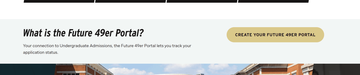
On the Apply to Charlotte Section Landing Page, the “What is the Future 49er Portal?” section uses the Call to Action: Simple block to highlight one focused, high-value action: encouraging prospective students to set up their Future 49er profile at future49er.charlotte.edu.
Unlike sections that present multiple pathways or grouped resources, this moment on the page is centered around a single, important next step. The Call to Action: Simple component is intentionally used to isolate and emphasize that action without visual competition.
Why the Call to Action: Simple Block Was Used
This block is appropriate in this section because:
It emphasizes one primary action. The goal is clear: encourage users to create or access their Future 49er Portal account.
It reduces cognitive load. By presenting only one focused action, the component prevents distraction and keeps the user’s attention on the intended next step.
It reinforces a recurring conversion point. The Future 49er Portal is referenced multiple times throughout the admissions journey. Repeating this call to action strengthens recognition and encourages follow-through.
It creates visual distinction. The Simple CTA block separates this action from surrounding informational content, signaling that it requires attention.
Strategic Role Within the Section Landing Page
A strong Section Landing Page should:
Present primary actions (e.g., how to apply).
Provide supporting resources (e.g., application guidance).
Reinforce essential tools or systems users must access.
The Future 49er Portal is a key tool in the admissions process. Using the Call to Action: Simple block ensures this system is not lost within paragraph text or embedded links. Instead, it stands independently as a clearly defined step in the applicant journey.
Because this action is both important and singular, the Simple CTA format is more appropriate than multi-card components. It delivers prominence without overwhelming the page with additional design elements.
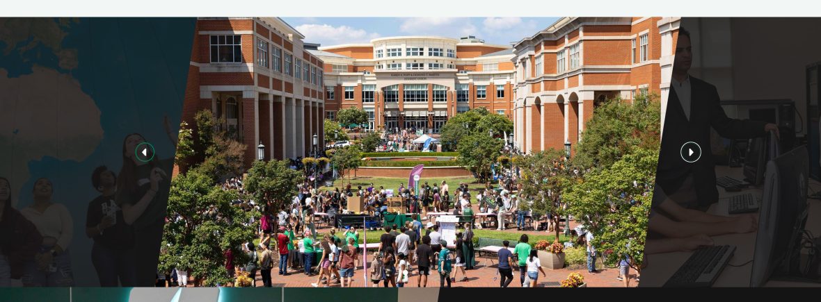
On the Apply to Charlotte Section Landing Page, the Image Carousel is used to showcase dynamic visual content such as campus shots, students in labs, and student life activities. This component allows prospective students to quickly engage with the look and feel of the university environment, reinforcing the context and energy of the admissions experience.
Why the Image Carousel Was Used
The Image Carousel is ideal for this section because:
It displays multiple related images without taking up excessive space. Visitors can view several highlights in the same page region while each image remains large and visually impactful.
It provides consistent captions for every image (optional) Unlike a standard image gallery where captions appear only on hover, the carousel ensures that captions are always visible, giving users context about each photo and its relevance.
It engages users visually. Images of campus life, labs, and student experiences help users imagine themselves at the university, supporting emotional connection and engagement with the admissions process.
It complements the Section Landing Page hierarchy. After guiding users through primary actions (applying) and supporting resources (child pages, tools), the carousel adds an experiential layer, enriching the page without distracting from calls to action.
Strategic Purpose Within the Section Landing Page
Section Landing Pages should balance functional navigation with engaging content. The Image Carousel:
Highlights the university environment in an organized, interactive way
Supports storytelling about student life and academic opportunities
Reinforces institutional branding through curated visuals
Provides a break between text-heavy sections while maintaining relevance to prospective students
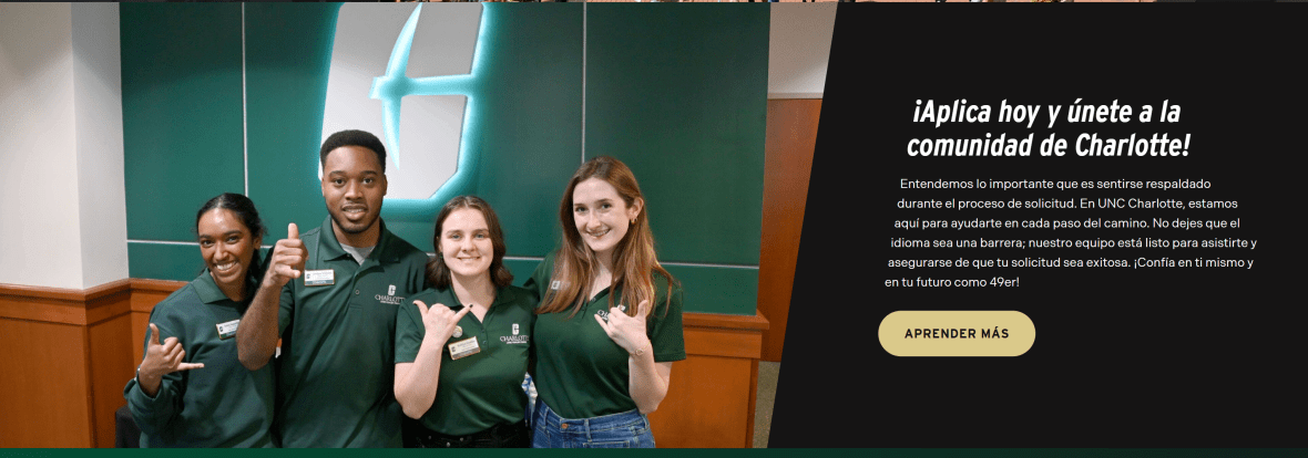
On the Apply to Charlotte Section Landing Page, the Call to Action Image is used to specifically engage Spanish-speaking prospective students, directing them to the Spanish-language admissions resources. This component combines text, a visual graphic, and a call-to-action button, creating a visually prominent, action-oriented section designed to stand out from surrounding content.
Why the Call to Action Image Was Used
This block is ideal for this section because:
It highlights a targeted audience. By visually separating this CTA and including language-specific messaging, the page ensures Spanish-speaking users immediately recognize content designed for them.
It draws attention through imagery and layout. The combination of a header, supporting description, graphic, and button creates a visually engaging unit that naturally attracts the user’s focus.
It supports a primary action. The block directs users to take a meaningful next step — in this case, accessing Spanish-language admissions materials — without requiring users to search through general content.
It reinforces equity and accessibility. By creating a clear, visually prominent path for a specific audience, the Section Landing Page ensures all users, regardless of language preference, can engage fully with key resources.
Strategic Role Within the Section Landing Page
Section Landing Pages should not only guide users to general content but also consider diverse audiences and unique user needs. The Call to Action Image:
Highlights an important, audience-specific next step
Maintains visual hierarchy while standing out from other blocks
Combines text and imagery to communicate the message clearly and quickly
Supports inclusion and accessibility goals by providing clear entry points for non-English speakers
This concludes the walkthrough of the Section Landing Page Guide. To see all of these components in action and explore a fully built page, click here to view the complete landing page example.

